
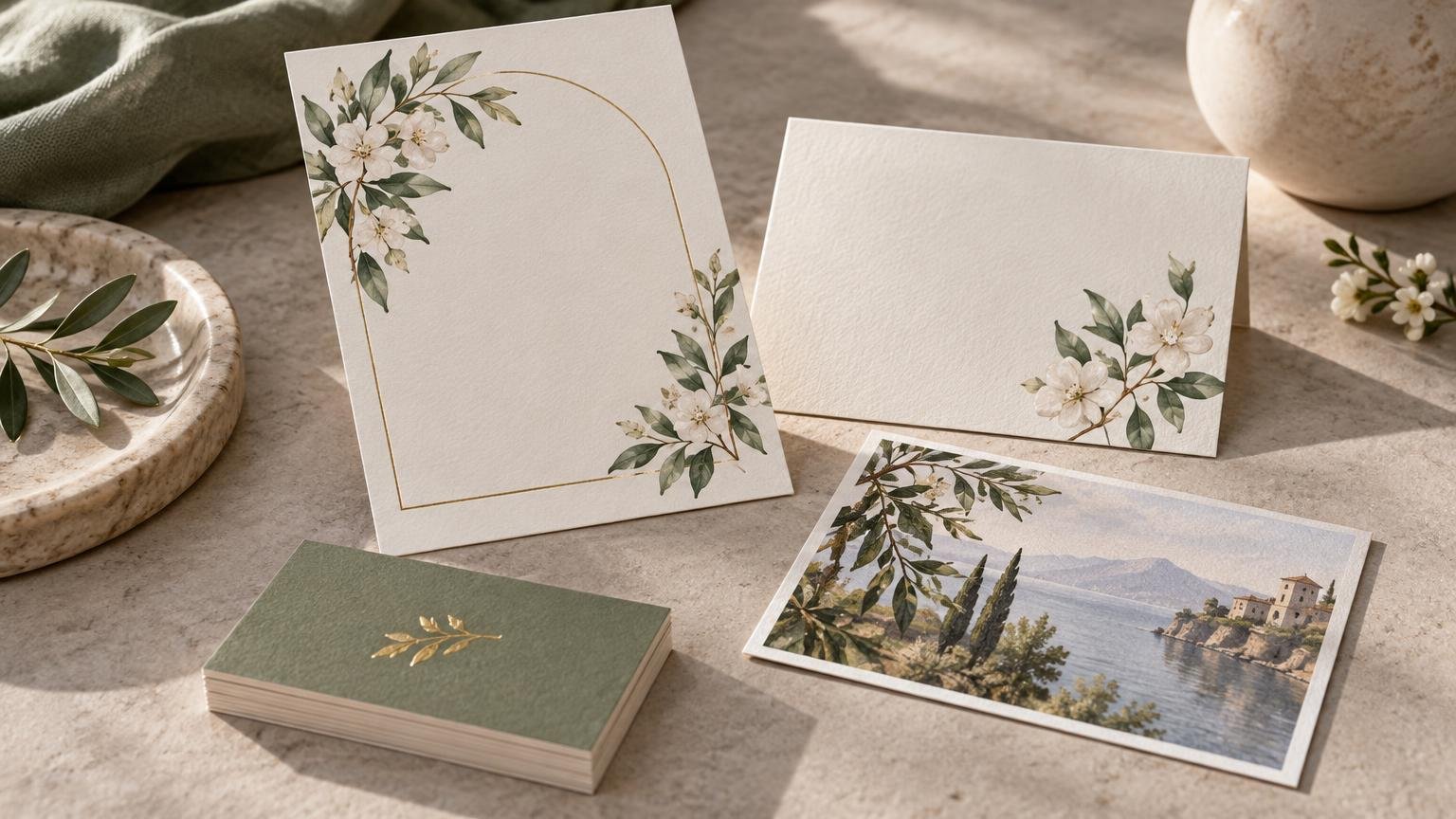
Card Printing for Invitations, Business Cards and Stationery
Practical guidance on paper, finishes, design, and proofing helps you choose cards that look right, read clearly, and feel intentional.
Card Printing for Invitations, Business Cards and Stationery
Card Minted is for readers who know a printed card is more than artwork on a rectangle. We cover how paper, finish, color, typography, trim and handling work together across invitations, business cards, thank-you notes, announcements, postcards and stationery. The goal is simple: help you make choices that still look sensible once the design leaves the screen.
A finish can sharpen a design, soften it or turn it into a tiny reflective distraction. Paper can feel crisp and intentional, provide a useful writing surface or fight the artwork at every turn. Our guides translate those physical differences into practical decisions, keeping the focus on readability, feel, durability and the way each piece will actually be used. The right choice is rarely the loudest one; it is the one that lets the message do its work.
That means looking beyond broad labels such as premium or heavyweight. We explain measurements and surfaces in context, compare smooth and textured stocks, and examine when shine, depth or extra stiffness adds something worthwhile. We also cover the less glamorous details—borders, small type, folds, envelopes and file preparation—that often decide whether a card feels finished. A useful card should look considered from the first glance to the last trip through a pocket, mailbox or stack of correspondence.
Latest from Card Minted
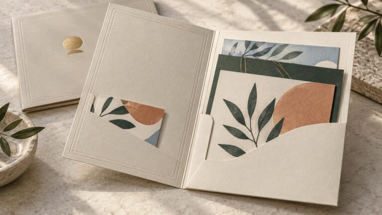
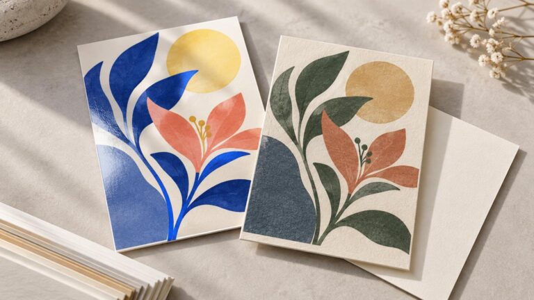
Choose for the Card’s Real Job
Good card printing starts with the object’s job. An invitation needs to set a tone and survive handling. A business card must remain legible after time in a wallet or pocket. A thank-you card may need a surface that accepts handwriting cleanly. A postcard has to balance visual impact with the practical demands of mailing. The format is part of the message, not merely the container for it.
Design and material should support each other rather than compete for attention. Fine typography benefits from a surface and process that preserve its edges. Photographs need thoughtful color and finish choices. A textured stock may add character, but it can also complicate fine detail. Specialty effects work best when they create a clear focal point instead of decorating every available millimeter.
Proofing ties those decisions together. Before approving a card, check the words, final dimensions, safe areas, trim, alignment, image quality, folds and finish placement. Confirm current specifications and ordering details when they matter; paper names and production options are not universal. Then choose the stock, surface and format that suit how the finished piece will be read, held, mailed or displayed. The best finishing touch is usually the one that makes the whole piece feel inevitable.