Print Embellishment for Direct Mail

Print Embellishment for Direct Mail

TLDR: Print embellishment for direct mail is worthwhile when it gives the recipient a useful visual or tactile cue: a foil headline that establishes hierarchy, a raised coating that invites touch, an embossed mark that adds quiet depth, or a paper surface that makes the entire piece feel considered. Pick one primary effect, keep the offer easy to read, proof it at actual size, and have the completed mail format checked against current postal requirements.

The best embellishment is not necessarily the shiniest one. It is the effect that supports what the mailpiece needs to communicate and survives the practical business of being printed, folded, addressed, sorted, and handled. A postcard promoting a limited-time offer has different needs from an envelope-enclosed invitation or a folded brand introduction.

What counts as print embellishment for direct mail?

An embellishment is an effect added beyond the base printed image. The category includes foil stamping, digital foil, UV coatings, embossing, film lamination, laser cutting, and other decorative processes. The Foil & Specialty Effects Association provides a useful overview of these processes in its specialty-effects design resources.

Paper choice belongs in the same decision even though stock is not technically a post-print embellishment. Texture, stiffness, coating, color, and opacity affect every square inch of a mailpiece. In many cases, moving from an ordinary smooth sheet to an intentional uncoated or textured stock produces a more coherent result than adding a small decorative flourish.

Keep the layers conceptually separate: stock is the material; ink or toner creates the base image; a coating or laminate changes the surface; foil adds a reflective element; and embossing, debossing, or letterpress physically changes the sheet. That distinction helps when requesting estimates and building artwork.

Compare visual and tactile effects

Option What changes Good uses Main cautions
Foil stamping or flat digital foil Reflective color and sharp visual contrast Logos, short headlines, borders, small focal details Fine elements and registration need production review; glare can reduce readability
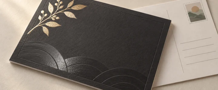
Raised digital foil Reflective color plus a dimensional surface Premium marks, patterns, seals, restrained display type Added relief may be unsuitable near folds or mail-processing areas
Spot UV Localized gloss contrast against a less reflective surface Patterns, photos, large lettering, subtle brand details Contrast can disappear under flat lighting; dark areas may show handling marks
Raised or profile UV Gloss plus noticeable surface height Large shapes, textures, selective graphic accents Tiny details and fold placement require provider-specific testing
Embossing or debossing Paper is shaped upward or downward Monograms, seals, uncomplicated logos, quiet typography Reverse-side show-through and stock suitability must be considered
Letterpress A printed or blind impression in the paper Short copy, line art, invitation-style cards, restrained designs Not every stock accepts an impression equally; dense layouts can become visually busy
Lamination A film changes protection, feel, and surface appearance Frequently handled pieces and designs needing a uniform finish Can alter fold behavior, recyclability assumptions, writability, and compatibility with later effects
Textured or cotton stock Changes the character of the whole printed surface Minimal layouts, personal messages, invitation-style mail Texture may soften fine detail and affect large solids or photographic reproduction

Foil: strongest when used as hierarchy

Foil earns its place when reflectivity directs attention to something important: a name, date, logo, short promise, or response cue. It becomes less useful when every border, icon, and line of text receives the same treatment. If everything flashes, nothing leads.

The production method also matters. FSEA explains that toner-based digital foil bonds foil to toner using heat, while polymer-based systems can first apply a raised polymer to create dimensional foiled areas. These are not interchangeable results, so ask whether the quoted effect is flat or raised and request process-specific artwork instructions.

Spot UV: contrast first, texture second

Conventional spot UV is primarily a selective shine treatment. It can reveal a pattern as the piece moves through the light without introducing another ink color. Raised or profile UV uses greater coating height to create a more tactile or embossed-looking result. FSEA distinguishes spot and flood UV approaches from raised or profile applications that add texture.

Use ordinary spot UV when gloss contrast is the point. Choose a raised version only when the physical profile adds something meaningful. A raised coating on every decorative element can make a piece feel more like a product sample than a clear sales message.

Embossing, debossing, and letterpress: quieter depth

These effects depend on light and shadow rather than metallic reflection. Embossing lifts an area, while debossing presses it down. Letterpress commonly combines ink with an impression, although a blind impression can omit the ink. They work especially well for uncomplicated marks and short lines because the physical form remains legible without competing with paragraphs of copy.

Stock selection is central here. A paper that looks substantial on a specification sheet may not produce the desired impression, and a deep effect may show on the reverse. If the reverse carries essential terms, an address, or a clean photograph, review both sides rather than approving the glamorous side and hoping for the best.

Choose the effect by the design goal

Start with what the embellishment must accomplish. This avoids the expensive habit of choosing a process first and inventing a reason afterward.

  • For immediate visual hierarchy, use a restrained foil element or strong gloss contrast.
  • For touch, consider raised UV, embossing, debossing, letterpress, or a distinctive uncoated stock.
  • For quiet character, let paper texture and typography do most of the work.
  • For handling protection, investigate an appropriate coating or laminate rather than treating decoration as durability.
  • For photographic impact, prioritize a surface that supports the image before adding a competing tactile effect.
  • For a handwritten response area, preserve an uncoated, writable surface and verify pen compatibility on the actual stock.

A stock upgrade is often the better choice when the design is minimal, the piece will be held for more than a moment, or the message depends on warmth rather than spectacle. Our guide to choosing cardstock for cards and postcards explains why the right stock changes with use. If weight terminology is clouding the decision, remember that GSM, basis weight, and point thickness describe different properties; see the cardstock paper-weight explainer rather than relying on a universal conversion chart.

Match the embellishment to the mail format

Postcards

A postcard has no envelope to protect its surface, and one side must perform the unromantic but essential work of carrying postal information. Keep decorative effects away from the address, barcode, postage, and other mail-processing areas unless the mail provider approves the finished layout. A tactile accent on the promotional face can work well, but it should not turn the card into an inflexible or irregular object without a postal review.

Folded self-mailers

Place embellishments only after the fold plan is settled. Raised coatings, foil, laminates, and impressed areas can behave differently when creased. Check whether an effect crosses a fold, lands under a tab, changes how panels lie, or appears upside down after opening. The imposed production proof matters more than a collection of attractive single pages.

Envelope-enclosed cards

An enclosure allows greater freedom because the outer envelope handles addressing and initial machine contact. This is the natural territory for tactile cards, restrained foil, letterpress, and invitation-like presentation. For projects that need deeper production guidance, invitation printing options can provide a relevant next step. Even inside an envelope, however, dimensional elements should be evaluated for overall thickness, fit, and potential marking against adjacent pieces.

Protect the mailing side

USPS states that a delivery address belongs on the postage side of a mailpiece. For letter-size pieces, it recommends positioning the address within the optical character reader area. The current dimensions and other applicable rules should be checked directly in the USPS Postal Explorer guidance, not copied from an old template or assumed from a previous campaign.

Treat those rules as the beginning of a mailing review, not as blanket approval. Size, thickness, flexibility, aspect ratio, folds, tabs, attachments, coatings, and mailing category can all affect processing. Ask the printer or mail provider to review the completed construction, including the actual stock and embellishments, before the full run.

Proof specialty effects at actual size

A PDF can show placement, but it cannot fully communicate reflection, relief, stiffness, texture, or how an effect changes as the piece moves. If a physical production proof is available and the effect is central to the concept, it is usually the meaningful proof. If only a digital proof is offered, clarify what it does and does not represent.

Review the proof with this checklist:

  • Read every line at actual printed size, especially disclaimers, dates, URLs, and response instructions.
  • Check whether foil or gloss reduces contrast under direct and angled light.
  • Inspect the registration between printed artwork and the embellishment.
  • Confirm that fine lines, counters in letters, and small gaps remain open.
  • Examine both sides for show-through, impression, surface marking, or unintended texture.
  • Fold the piece in the intended direction and inspect cracking, lifting, alignment, and panel order.
  • Confirm trim position, especially around borders and elements intended to sit near an edge.
  • Test any area meant for handwriting with the pens recipients are likely to use.
  • Review the address side as a mailing surface, not merely as the back of the design.
  • Verify that the approved file contains the printer’s required separate effect layer, naming, color, and overprint settings.

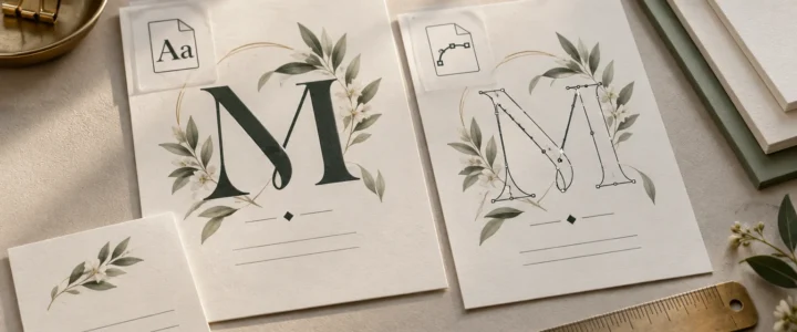
Typography deserves its own pass. A font problem can become especially expensive when the same faulty text is repeated in foil or a die-based effect. Before upload, check the guidance on whether to embed or outline fonts for printing and follow the production provider’s current file specification.

When is an embellishment worth paying for?

An upgrade is easier to justify when the mailpiece has a focused audience, a strong offer, a longer useful life, or a presentation where physical character supports the message. A dimensional mark can make sense for a design firm’s introduction. A textured invitation-style card can support a private event. A restrained foil date may help an announcement feel deliberate.

Simplify when the effect obscures the response path, conflicts with photography, creates unresolved mailing questions, or requires several weak compromises in type size and layout. Also simplify when the base paper and printing are not yet right. Foil cannot rescue muddy contrast, and embossing does not improve a confusing offer. It merely makes the confusion three-dimensional.

Before approving production, compare the embellished version with one strong alternative: better paper, cleaner typography, or a simpler finish. If the effect strengthens hierarchy, touch, or occasion at a glance—and the mailing review raises no problems—it has earned its place. If not, choose the stock and surface that make the message easiest to notice, read, and keep.
References

  1. Designing with Specialty Effects – FSEA
  2. Foil Stamping – FSEA
  3. SpecialtyUV Coatings – FSEA
  4. 102 Elements on the Face of a Mailpiece | Postal Explorer

Embed Fonts vs Outline Fonts: Which Is Better for Printing?

Embed Fonts vs Outline Fonts: Which Is Better for Printing?

TLDR: Embed fonts in your print PDF by default. If the PDF reports the fonts as embedded or embedded subsets, displays correctly, and meets your printer’s requirements, there is usually no reason to outline everything. Convert text to outlines only when a printer specifically requests it, a font cannot be embedded, or a small amount of finalized display text needs to become independent of its font file. Always preserve an editable master before outlining.

The practical answer to embed fonts vs outline fonts is less dramatic than design forums sometimes make it sound. Both methods can prevent unwanted font substitution, but they do it differently. Embedding keeps text as text and packages permitted font data in the PDF. Outlining turns letters into vector shapes. For invitations, business cards, and stationery, embedding is normally the cleaner and more reversible workflow.

Font handling is also separate from the tactile decisions that make a card feel substantial. Outlining a script font will not make cardstock thicker, a matte surface smoother, or foil more reflective. It solves a file-dependency problem, not a paper or finishing problem.

Embedded fonts vs outlined fonts at a glance

Method What the PDF contains Main advantage Main drawback Best use
Embedded fonts Text plus permitted font data Preserves text behavior and avoids substitution when correctly embedded Embedding may be restricted by the font’s permissions The normal choice for verified print PDFs
Embedded subsets Text plus only the glyphs used in the document Can preserve appearance while including less font data Later editing may require characters that were not included Final PDFs that have already passed copy review
Outlined fonts Letters converted into vector paths Removes the output file’s dependency on the font Text is no longer normally editable as text A targeted fallback or printer-requested workflow

What embedding a font actually does

Font embedding places font information inside the PDF so another system does not have to find the same installed font. Adobe distinguishes full embedding from subset embedding. A full embedding includes the font, subject to its permissions, while a subset contains the glyphs used in the document. Correct embedding helps prevent font substitution when the file is opened or printed elsewhere. Adobe’s explanation of PDF font embedding and substitution provides the technical background.

Seeing “Embedded Subset” in a PDF font report is not automatically an error. It generally means the PDF contains the characters it needs rather than the complete font. For a finalized invitation containing only names, dates, and event details, that can be perfectly appropriate. The important questions are whether every font is accounted for, the PDF displays correctly, and the printer accepts the file.

Fonts can carry permissions that restrict embedding. A successful export therefore cannot be assumed for every typeface or every PDF workflow. If a font refuses to embed, check its license and export permissions rather than repeatedly changing random PDF settings and hoping the problem develops manners.

What happens when you outline text

Converting text to outlines changes each letter into one or more vector paths. The output no longer needs that font to draw those shapes, but the words also lose their normal text properties. Standard text editing, spell-checking, character substitution, and typographic controls are no longer available in the usual way.

That tradeoff matters on stationery because copy tends to change late. A ceremony time moves. A phone extension changes. Someone notices that “accommodations” has been misspelled in 36-point calligraphy. Editing outlined letters is closer to modifying a small illustration than correcting a sentence.

Adobe also notes that outlining removes font hinting and cautions that outlined type can appear less sharp at small sizes or low resolution. That does not mean outlined type always prints badly. It means outlining is not a universal quality upgrade, especially for tiny addresses, RSVP details, disclaimers, or compact business-card text. Review such type at actual size rather than judging it only at 800% zoom.

When converting text to outlines makes sense

Outlining is reasonable when there is a confirmed technical reason rather than a vague belief that printers prefer it. Common cases include:

  • Your printer explicitly requires outlined text for the selected workflow.
  • A licensed font will not embed, and the font’s terms permit the intended use and conversion.
  • The printer reports a missing-font problem after checking your submitted file.
  • A finalized logo, monogram, or short display treatment must remain visually fixed.
  • A specialty-production template specifically instructs you to supply certain lettering as vector artwork. Confirm the exact setup with the producer rather than applying that rule to the entire design.

Printer requirements differ. PrintRunner, for example, says that outlines are required in most cases when one of its jobs is held for missing fonts, although supplying a font file may sometimes be possible. It also warns that outlined text cannot later be typeset as ordinary text. That is a PrintRunner-specific workflow statement, not a rule for every commercial printer.

Why outlining every line is usually unnecessary

Blanket outlining creates extra risk without necessarily improving the printed object. It makes corrections slower, complicates accessibility and text extraction, and can make small type less forgiving. It may also leave a designer with only a flattened final file when the event date, employee title, or return address inevitably changes.

For a wedding invitation, outlining a custom monogram may be sensible if required; outlining the invitation, RSVP card, details card, and envelope copy before the wording is locked is not. Keep the suite editable through copy approval. The same principle applies to a business-card system: preserve editable names and contact details even if a fixed wordmark is supplied as vector artwork. See the guide to keeping a wedding invitation suite consistent or the business card layout and finish guide for the object-specific decisions surrounding those files.

How to check fonts in a print PDF

Do not rely only on the fact that the PDF opens on your own computer. Your computer may already have the fonts installed, which can conceal a missing-font problem. Use this pre-upload process instead:

  1. Save the editable source document under a clear master filename before changing any text.
  2. Export a new PDF using the printer’s current file specifications. Do not assume that one PDF preset suits every provider or specialty process.
  3. Open the exported PDF in a tool that can report document fonts. In many desktop Acrobat versions, the font list is available through the document properties, although menu labels can vary by version.
  4. Confirm that each expected typeface is identified as embedded or embedded subset. Investigate an unembedded font before upload.
  5. Inspect every page at normal viewing size and at high magnification. Look for substituted letters, missing glyphs, altered line breaks, shifted punctuation, broken ligatures, and unexpected boxes.
  6. Print a paper proof at 100% scale when practical. A desktop print is not a prediction of commercial color or paper feel, but it can expose type that is physically too small, cramped, or close to trim.
  7. If the printer provides a proof, compare it with the approved copy and your exported PDF. A proof is a checkpoint, not a ceremonial button labeled “yes.”

PrintRunner identifies PDF as its preferred file format and includes CMYK color, resolution, bleed, safe-area, and proofing guidance in its file-preparation instructions. Those requirements demonstrate why font status is only one part of preflight. Follow the current specifications of the printer actually producing the job.

A card and stationery proof needs more than a font check

Once the fonts are stable, inspect the details that will become physical. Small-format pieces are especially unforgiving because a tiny spacing or trim problem occupies a larger share of the design.

  • Copy: Verify names, dates, URLs, addresses, phone numbers, titles, and punctuation against the approved text.
  • Scripts and alternates: Check every capital, ligature, swash, numeral, and accented character. Decorative fonts can hide errors rather elegantly.
  • Actual-size readability: View or print the piece at 100% scale. Thin strokes and tiny reverse type deserve particular attention.
  • Bleed and trim: Extend background artwork according to the printer’s specifications and keep essential text inside its stated safe area.
  • Borders: Thin, close-fitting borders make small trim variation visually obvious. A wider margin or borderless design is often calmer.
  • Contrast: Make sure type remains distinguishable from photographs, patterns, and dark backgrounds.
  • Multiple pieces: Compare repeated names, colors, type sizes, and spacing across invitations, inserts, envelopes, thank-you cards, or employee card versions.

For invitation-specific checks, the wedding invitation printing checklist covers size, trim, paper, and finishing decisions that sit beyond font handling.

Paper and finish are a separate decision

Embedding and outlining determine how letterforms are represented in a file. They do not determine cardstock weight, stiffness, texture, coating, glare, writability, or the result of a specialty process. Those characteristics come from the selected stock, surface, print process, and finishing setup.

A textured stock, for example, can be a style choice with implications for very fine letterforms, while a glossy surface can change glare and perceived contrast. Those are production and design questions, not reasons to outline fonts. If the physical surface is still undecided, compare it separately using the guide to cardstock finishes. Confirm currently available stocks and finish-specific artwork requirements with the chosen printer before preparing final files.

A simple decision rule

  1. First, export a PDF with fonts embedded.
  2. Next, verify that every font is embedded or embedded as a subset and that all text displays correctly.
  3. If verification succeeds and the printer accepts embedded fonts, submit that PDF.
  4. If a font cannot be embedded, check its permissions and ask the printer which remedy it accepts.
  5. If outlines are required, duplicate the editable master, outline only the necessary final text, and export a separately named production PDF.
  6. Review the outlined production file at actual size and compare every word with the approved copy.

The final choice

For most invitations, cards, and stationery, choose an embedded-font PDF that has passed a proper font and visual check. Use outlines as a controlled fallback, not as a magic print-quality switch. Keep the source file editable, follow the selected printer’s current specifications, and inspect small type at the size people will actually hold in their hands. Then move on to the paper and finish—the decisions your fingers will notice.

References

  1. Font embedding and substitution in PDFs with Distiller | Adobe Acrobat
  2. Create outline text in Illustrator on the web (Beta) | Illustrator
  3. Convert text to outlines in InDesign | InDesign
  4. Frequently Ask Questions | PrintRunner
  5. File Preparation Guide – Format, Size, Bleed, etc. | PrintRunner

How to Make Personalized Trading Cards From Family Photos for Gifts

TLDR

Choose one strong photo per card, keep the design close to normal trading-card proportions, use the back for the personal details, and create a consistent set rather than designing every card differently. Personalized trading cards work especially well for birthdays, Father’s Day, weddings, graduations, family reunions, and kids’ sports gifts.

We take more photos than any generation before us and somehow print fewer of them.

Most stay in a phone until the phone gets replaced.

A personalized trading card is one way to turn a favorite photo into something physical without making another standard framed print.

And learning how to make personalized trading cards from family photos for gifts is pretty simple once you stop thinking like a graphic designer and start thinking like a card collector.

The card needs a clear subject.

The front needs to be easy to read.

The back is where the story lives.

Start With the Person, Not the Template

Pick the photo before you pick the card style.

Look for an image with:

  • A clear subject
  • Enough resolution
  • Good separation from the background
  • Room around the head or body for cropping
  • An expression that feels like the person

Sports photos are an obvious fit, but they are not the only option.

Custom trading cards are now commonly made around pets, couples, weddings, trips, cars, milestones, and family members as well as athletes.

That opens up a lot of gift ideas.

Use Familiar Trading-Card Proportions

Standard collectible cards are often around 2.5 x 3.5 inches.

That format immediately feels recognizable in the hand.

You can certainly make oversized cards or unusual formats, but there is something satisfying about a personalized card that fits naturally into a sleeve, binder page, or protective case.

If the project is intended as a collectible gift, keeping familiar proportions is usually the simplest choice.

Keep the Front Simple

The card front does not need somebody’s complete biography.

Usually, it needs:

  • Photo
  • Name
  • Short title or position
  • Number, year, or date
  • Small visual details

For a child playing baseball:

Ethan Miller
Shortstop
#12
2026 Season

For Grandpa:

Robert “The Grillmaster” Jensen
Backyard Division
Career Record: Undefeated

The joke works because the card still looks organized.

If everything is a joke, nothing stands out.

Put the Fun Details on the Back

The back is where personalized trading cards become better gifts.

You can include real or playful stats such as:

  • Birth year
  • Graduation year
  • Favorite food
  • Years married
  • Home runs
  • Goals scored
  • Cups of coffee per day
  • Dad jokes delivered
  • Countries visited
  • Favorite movie
  • Nickname
  • Short biography

This is also a good place for a personal message.

A wedding-party card might include how the couple knows the person.

A youth-sports card might include season statistics.

A pet card could include favorite snack, special move, and known weaknesses.

There are very few rules here.

Build a Set for Groups

One personalized card is a gift.

A set can become the event.

Consider making cards for:

  • Entire youth sports team
  • Wedding party
  • Family reunion
  • Graduating class
  • Office team
  • Vacation group
  • Fantasy league

Keep the same basic template while changing the photograph and details.

That creates the feeling of a real collection.

It also makes the design process much faster than reinventing every card.

Think About How You Will Present Them

A single card can go into a protective sleeve or magnetic case.

A set can be packaged in:

  • Small card box
  • Foil-style pouch
  • Clear sleeve
  • Custom envelope
  • Binder page

You can also add a small branded or event-specific sticker to the outside.

For example, custom die-cut vinyl stickers can be created in custom shapes and sizes, which gives you an easy way to match a family reunion logo, team mark, wedding monogram, or other graphic to the card set.

Use Photos You Have Permission to Use

Family photography is usually straightforward when you took the picture yourself.

Professional photography can be different.

If a school photographer, sports photographer, wedding photographer, or studio created the image, make sure you have permission to reproduce it.

Purchasing a print does not always mean purchasing reproduction rights.

This is one of those small details worth checking before ordering an entire team set.

Print One Before Printing Fifty

The screen does not tell you everything.

Print a prototype and check:

  • Photo crop
  • Text size
  • Contrast
  • Skin tones
  • Small statistics
  • Card-back readability
  • Overall feel in the hand

A photograph that looks bright on a phone can print darker.

Small text that looks fine while zoomed in can feel uncomfortable at actual size.

Fix those issues on card number one.

Give the Card a Reason to Be Kept

The best personalized trading cards are not trying to fool anyone into thinking they are commercial sports collectibles.

Their value comes from being specific.

They preserve one person’s season, wedding, pet, family role, running joke, or milestone in a format associated with collecting.

That is why figuring out how to make personalized trading cards from family photos for gifts is less about fancy software and more about choosing the right details.

Use a good picture.

Keep the front clean.

Put the story on the back.

Then make something the recipient will probably keep much longer than the photo would have survived in their camera roll.

Custom Birthday Invitation Cards Online: How to Make the Party Feel Planned Before It Starts

Custom birthday invitation cards online can make a party feel more pulled together before anyone has bought balloons, ordered cake, or realized the guest list has somehow become 47 people.

A birthday invitation does more than share the date and location. It sets the tone. It tells guests what kind of party they are walking into. A backyard barbecue, a first birthday, a surprise 40th, a roller rink party, and a quiet dinner all need very different invitations.

The good news is that birthday invitations do not need to be complicated. They need to be clear, readable, and matched to the party. That is it. Well, that and not forgetting the address, which is apparently harder than it should be.

Start With the Type of Birthday Party

Before designing the card, define the party.

Is it for a child?
A milestone birthday?
A surprise party?
A themed party?
A dinner party?
A casual open house?
A destination weekend?
A joint birthday?
A first birthday with family photos?

The event type affects everything: wording, colors, paper, layout, and how much information needs to be included.

A kids’ party invitation can be bright and playful. An adult milestone invitation may be cleaner or funnier. A surprise party invitation needs the word “surprise” to be impossible to miss. A first birthday invitation might lean more sentimental because the guest of honor is mostly interested in cake destruction.

Make the Details Easy to Find

The most important information should be obvious.

Include:

  • Name of the person being celebrated
  • Age or milestone, if relevant
  • Date
  • Time
  • Location
  • RSVP details
  • RSVP deadline
  • Dress code, if any
  • Theme notes
  • Gift instructions, if needed

For kids’ parties, include parent contact information. For adult parties, include parking or venue details if the location is not obvious. For surprise parties, include arrival time and actual surprise time if they are different.

Do not bury key details in tiny text at the bottom. Guests will miss them, then text you one by one. This is how hosts age.

Match the Design to the Theme

A theme helps the invitation feel intentional.

Common birthday invitation themes include:

  • Dinosaurs
  • Space
  • Princess
  • Sports
  • Pool party
  • Disco
  • Retro
  • Garden party
  • Cocktail party
  • Western
  • Casino night
  • Brunch
  • Black and gold milestone
  • Photo collage

The theme does not have to take over the whole card. A few design elements are enough.

For example, a space party invitation can use stars, navy, silver, and one rocket. It does not need every planet, an astronaut, three moons, and a comet with a face. Unless the comet is important to the birthday child. In that case, respect the comet.

Use Photos When They Add Something

Photo birthday invitations can be great, especially for first birthdays, milestone birthdays, and family celebrations.

Use a photo if it makes the card feel more personal. Skip it if the design works better without one.

Good photo options include:

  • Baby photo for a first birthday
  • Current portrait
  • Funny throwback photo
  • Collage for milestone birthdays
  • Family photo for a shared celebration
  • Candid party-style image

Make sure the photo is high resolution and not too dark. Printed photos are less forgiving than screens. A picture that looks fine on your phone may look grainy on paper if it is low quality.

If the photo is busy, use a simple layout and solid text area. The design should help the photo, not pile more chaos on top of it.

Choose Paper Based on the Party

Not every birthday invitation needs heavy premium paper. But paper still affects how the card feels.

For casual kids’ parties, a sturdy standard card stock is usually enough. For milestone birthdays or formal dinners, a thicker stock can feel more appropriate. For photo-heavy designs, smooth paper often helps keep images crisp. For softer illustrated designs, a lightly textured stock can add warmth.

If the invitation will be mailed, think about weight and envelope fit. If it will be handed out, a thicker card can feel nicer and survive being shoved into backpacks, purses, and kitchen drawers.

Cards live dangerous lives.

Keep the Wording Natural

Birthday invitation wording should fit the party.

For kids:

Join us to celebrate Emma’s 5th birthday.

For adults:

Please join us for dinner and drinks to celebrate Maya’s 40th.

For surprise parties:

Shh. It is a surprise. Help us celebrate Daniel’s 50th.

For casual open houses:

Stop by anytime between 2 and 5 to celebrate.

The wording does not need to be clever unless clever fits the person. A simple invitation is often better than one trying too hard to be funny. Forced party puns are a slippery slope. First it is “taco bout a party,” then suddenly nobody trusts you with wording again.

Plan Matching Party Pieces

Once you have the invitation design, you can use the same style for other printed pieces.

Matching pieces might include:

  • Thank-you cards
  • Favor tags
  • Welcome signs
  • Food labels
  • Game cards
  • Table signs
  • Drink menus
  • Photo booth signs

This is especially useful for milestone birthdays, kids’ themed parties, and larger events. Matching pieces make the party feel planned without requiring expensive decorations.

A coordinated paper system can do more than people think. It quietly tells the room, “someone had a plan here.” Even if the cake is late.

Final Thoughts

Custom birthday invitation cards online are easiest to get right when you start with the party type, keep the details clear, and match the design to the mood of the event.

Choose readable wording. Use photos only when they help. Pick paper that fits the occasion. Coordinate extra pieces if you want the whole party to feel more finished.

A good birthday invitation does not need to be overdesigned. It just needs to tell guests where to go, what to expect, and why they should be excited.

Cake will handle the rest.

SEO Pack

Title options

Custom Birthday Invitation Cards Online Guide
How to Order Custom Birthday Invitation Cards Online
Custom Birthday Invitation Cards Online for Any Party

Focus keyphrase

custom birthday invitation cards online

SEO title

Custom Birthday Invitation Cards Online Guide

Meta description

Create custom birthday invitation cards online with clear wording, strong themes, photo tips, paper choices, and matching party pieces.

Slug

custom-birthday-invitation-cards-online

Excerpt

Custom birthday invitation cards online help set the tone for kids’ parties, milestone birthdays, surprise parties, and casual celebrations.

Tags

birthday invites, custom cards, party invitations, photo cards, milestone birthday, invitation wording, printed cards

Photo Graduation Announcement Cards: How to Make Them Feel Personal, Not Generic

Photo graduation announcement cards have one job, technically: tell people someone graduated. But a good card does a little more than that. It marks the end of a chapter. It gives family something to save. It gives grandparents something to put on the fridge immediately and possibly forever.

A graduation announcement is part update, part keepsake, part tiny victory lap.

The challenge is making it feel personal without overcrowding it. Graduation cards can quickly become a pile of photos, quotes, school colors, honors, future plans, and inspirational lines about journeys. Some of that is great. All of it at once can feel like the card is trying to give a commencement speech.

Keep it focused.

Choose the Right Main Photo

The photo is the center of the announcement, so choose it first.

A strong main photo should be clear, well-lit, and high enough resolution for printing. Outdoor senior photos work well. Cap and gown photos are classic. A candid photo can work if it still feels polished.

Avoid photos that are too dark, too blurry, or too zoomed out. If the graduate is the size of a decorative comma, choose another photo.

The best photo graduation announcement cards usually have one strong hero image rather than five competing images. Multiple photos can work, but the main image should still carry the design.

Decide What the Card Needs to Say

Graduation announcements can be simple.

Include:

  • Graduate’s name
  • School name
  • Graduation year
  • Degree or program, if relevant
  • Ceremony date, if announcing an event
  • Party details, if doubling as an invitation
  • Future plans, if desired
  • Parent or family names, if appropriate

Not every announcement needs every detail.

If it is just an announcement, keep it clean. If it is also a graduation party invitation, make the event details easy to find. Guests should not have to search the card for the party address while pretending they read the inspirational quote.

Use School Colors Carefully

School colors are a natural choice, but they can get loud fast.

A little navy and gold? Great. A full red-and-black layout with giant block letters and three mascots? Possibly a lot.

Use school colors as accents:

  • Name
  • Border
  • Year
  • Small graphic detail
  • Back side design
  • Envelope accent

This keeps the card connected to the school without making it look like a pep rally flyer.

If the photo already has strong colors, choose a simpler card palette. The design should support the photo, not wrestle it in the parking lot.

Pick a Layout That Matches the Photo

Different photos need different layouts.

A vertical portrait often works well with centered text underneath or beside it. A horizontal photo can look great as a full-bleed background with text placed in an open area. A close-up photo may pair well with minimal typography. A photo with a busy background may need a solid text block for readability.

Before choosing a layout, look at the photo’s empty space.

Is there room for text?
Is the background clean?
Is the graduate centered?
Would cropping cut off anything important?
Does the photo need a border?

A beautiful design can still fail if it fights the photo. The layout should make the image look better.

Keep Fonts Readable

Graduation announcements often use script fonts, serif fonts, or bold modern type. All can work. The problem starts when the name, school, date, and details are all in different decorative fonts.

Two fonts is usually enough.

Try:

  • One display font for the graduate’s name
  • One simple font for details

The graduate’s name can be expressive. The details should be easy to read. Nobody should have to guess whether the party starts at 5:00 or 6:00 because the numbers are wearing calligraphy costumes.

Consider a Two-Sided Card

A two-sided design gives you more room without cluttering the front.

The front can focus on the photo, name, and graduation year. The back can include:

  • Party details
  • A short note
  • Future plans
  • Additional photo
  • Quote
  • School information

This is especially useful if the announcement is doing double duty as a party invitation.

It also helps the card feel more finished. The front gets to be beautiful. The back gets to be useful. Everyone gets a job.

Make It Feel Like the Graduate

The best photo graduation announcement cards reflect the graduate’s personality.

A formal design may fit one graduate perfectly. Another may need something bold, colorful, or funny. A musician, athlete, artist, future engineer, first-generation college graduate, or high school senior heading into the trades may each deserve a slightly different tone.

Personal touches can include:

  • A favorite quote
  • Future school or career path
  • A meaningful location photo
  • A simple thank-you message
  • A small line about what comes next

Do not force personality into the card, though. Not every announcement needs a quote about chasing dreams. Some people chased algebra and survived. That is enough.

Proof Every Detail

Graduation cards are personal, which makes mistakes extra annoying.

Before printing, check:

  • Name spelling
  • School name
  • Graduation year
  • Degree or honors
  • Party date
  • Party time
  • Address
  • RSVP information
  • Photo quality
  • Cropping
  • Text contrast

Have the graduate review it too. This is their card. Also, they may notice if their name is accidentally written in a way that makes them want to leave the family group chat.

Final Thoughts

Photo graduation announcement cards work best when they are simple, personal, and easy to read.

Start with a strong photo. Choose a layout that fits the image. Use school colors as accents. Keep the details clear. Add personality without overcrowding the card.

A graduation announcement does not need to say everything. It just needs to mark the moment well.

The cap has been tossed. The card should not drop the ball.

SEO Pack

Title options

Photo Graduation Announcement Cards That Feel Personal
How to Design Photo Graduation Announcement Cards
Photo Graduation Announcement Cards for High School and College

Focus keyphrase

photo graduation announcement cards

SEO title

Photo Graduation Announcement Cards Guide

Meta description

Design photo graduation announcement cards with better photos, readable layouts, school colors, wording, and print-ready details.

Slug

photo-graduation-announcement-cards

Excerpt

Photo graduation announcement cards should feel personal, readable, and polished without trying to cram an entire senior year onto one card.

Tags

graduation cards, photo cards, announcement cards, custom printing, senior photos, grad party, school stationery

Custom Baby Shower Invitation Printing: Cute Without Becoming Chaos

Custom baby shower invitation printing is a little more delicate than people expect. Baby showers are joyful, sweet, and usually full of tiny animals, soft colors, clouds, bows, moons, stars, or fruit with faces. All good things.

But there is a fine line between charming and “a craft store exploded onto a 5×7 card.”

The best baby shower invitations feel warm, clear, and personal. They tell guests what they need to know, set the mood for the event, and give the host something that feels worth saving. Because yes, baby shower invitations often end up in keepsake boxes. Sometimes next to ultrasound photos, hospital bracelets, and other deeply emotional things that make everyone cry in a hallway.

No pressure.

Start With the Shower Style

Before choosing a design, decide what kind of shower it is.

Is it casual and cozy?
A brunch shower?
A backyard shower?
A co-ed celebration?
A formal luncheon?
A sprinkle for a second or third baby?
A themed party with very committed decorations?

The invitation should match the event.

A soft watercolor design works beautifully for a garden shower. A bold retro design may be better for a playful brunch. A minimalist card can feel elegant for a small family gathering. A woodland animal theme is basically legally required to include at least one fox looking emotionally supportive.

The style does not need to be complicated. It just needs to match the actual party.

Include the Essential Details

A baby shower invitation should be easy to read. Guests should not need to decode it like an ancient scroll.

Include:

  • Parent or parents being celebrated
  • Date
  • Start and end time, if applicable
  • Location
  • Host name
  • RSVP instructions
  • RSVP deadline
  • Registry details
  • Dress code, if any
  • Theme notes, if guests need to know

If the shower is a surprise, make that painfully clear. Put it somewhere guests cannot miss. People are lovely, but they will absolutely text the guest of honor “can’t wait for your shower” if you give them the chance.

For registry information, keep it simple. A small line with the registry location or website is usually enough. No need to make the card feel like a product catalog.

Choose Wording That Fits the Mood

Baby shower wording can be sweet, funny, traditional, or modern.

A formal shower may use wording like:

Please join us for a baby shower honoring…

A casual shower may sound more like:

Let’s celebrate baby on the way.

A co-ed shower might say:

Join us for a baby shower honoring the parents-to-be.

A sprinkle could say:

A little sprinkle for baby number two.

The wording should sound like the host and the event. If the family is relaxed and funny, let the invitation be relaxed and funny. If the event is more traditional, keep the wording polished.

Just avoid making the poem do too much. Rhyming is cute until it starts holding important details hostage.

Pick Colors That Print Clearly

Soft colors are popular for baby shower invitations, and they can look great. But pale colors need contrast.

If the background is light pink, cream, pale blue, sage, or butter yellow, make sure the text is dark enough to read easily. The invitation may look clear on screen and still print too faint if the contrast is weak.

Good print-friendly combinations include:

  • Cream background with dark green text
  • Pale blue background with navy text
  • Blush background with charcoal text
  • White background with warm brown text
  • Soft yellow background with deep gray text

You can still use light colors. Just do not use light colors for every important element. Guests should be able to read the address without moving the card under three lamps.

Think About Paper Feel

Paper matters for custom baby shower invitation printing because the card is often held, displayed, or saved.

A thicker card stock gives the invitation a more polished feel. Smooth stock works well for clean modern designs. Light texture can make watercolor or illustrated designs feel softer and more tactile.

If the design includes a lot of small detail, choose a paper that keeps the artwork crisp. If the design is simple and typographic, paper texture can add interest without cluttering the layout.

The paper does not need to be overly fancy. It just needs to feel intentional.

Make the Design Personal

A baby shower invitation does not have to be custom illustrated to feel personal.

Small details can do a lot:

  • Baby’s name, if known
  • Parent names
  • A theme tied to the nursery
  • A favorite animal or motif
  • A meaningful color palette
  • A small personal note from the host
  • A photo, if appropriate

If the parents are not finding out the baby’s gender, the invitation can still feel specific. Use warm neutrals, green, yellow, clay, blue-gray, or a theme that is not tied to gender. Books, stars, animals, rainbows, citrus, bees, and garden themes all work well.

The goal is not to make the card look like everyone else’s baby shower. The goal is to make it feel like this baby shower.

Coordinate the Extras

If the shower has matching pieces, plan them together.

You might need:

  • Thank-you cards
  • Welcome sign
  • Favor tags
  • Game cards
  • Menu cards
  • Table signs
  • Diaper raffle cards
  • Book request cards

Matching printed pieces can make the event feel pulled together without needing elaborate decorations. A simple invitation design can become the foundation for the whole shower look.

This is where custom printing helps. You are not stuck trying to match a random invitation to random game cards from a different shop. That is how you end up with four shades of beige and a duck wearing sunglasses. Maybe charming, maybe not.

Final Thoughts

Custom baby shower invitation printing works best when the invitation is clear, personal, and connected to the style of the event.

Choose the mood first. Keep the wording readable. Use soft colors with enough contrast. Pick paper that feels good in hand. Then coordinate any extras so the shower feels intentional from invitation to thank-you card.

A baby shower invitation should feel sweet without making guests work too hard. The baby is already doing enough. Probably hiccuping in there. Very busy.

SEO Pack

Title options

Custom Baby Shower Invitation Printing Guide
Custom Baby Shower Invitation Printing Tips for Hosts
How to Plan Custom Baby Shower Invitation Printing

Focus keyphrase

custom baby shower invitation printing

SEO title

Custom Baby Shower Invitation Printing Guide

Meta description

Custom baby shower invitation printing tips for wording, colors, paper, themes, registry details, and matching shower cards.

Slug

custom-baby-shower-invitation-printing

Excerpt

Custom baby shower invitation printing helps hosts create clear, personal, and coordinated invitations for a celebration that feels thoughtful.

Tags

baby shower, custom invitations, shower invites, printed cards, party stationery, invitation wording, event cards

Custom Wedding Invitation Suite Printing: How to Keep Every Piece Looking Like It Belongs Together

Custom wedding invitation suite printing is not just about making one pretty invitation. That is the obvious part. The harder part is making the invitation, RSVP card, details card, envelopes, inserts, and any follow-up pieces look like they came from the same event instead of four different Pinterest boards having a small argument.

A wedding suite works best when it feels coordinated. Not identical. Coordinated. There is a difference.

You want the pieces to share the same visual language: paper, color, typography, spacing, and tone. That way, when guests open the envelope, the whole thing feels intentional before they even read the date.

And yes, people notice. Maybe not everyone. Your cousin who thinks “semi-formal” means clean sneakers may not notice. But plenty of guests will.

Why a Wedding Invitation Suite Matters

A wedding invitation suite does more than tell people where to show up. It sets expectations.

A formal black-and-white suite says something different than a colorful garden invitation. A minimal letterpress-style card feels different from a playful illustrated suite. A destination wedding insert with warm colors and relaxed wording creates a very different mood than a traditional ballroom invitation.

The suite helps guests understand the event before they arrive.

It can also answer practical questions:

  • Where is the ceremony?
  • Where is the reception?
  • Is there a dress code?
  • Are kids invited?
  • How do guests RSVP?
  • Where should they stay?
  • Is transportation provided?
  • Is there a wedding website?

Trying to cram all of that onto one card is how invitation layouts start gasping for air. A suite gives every detail a place to live.

Start With the Main Invitation

The main invitation is the anchor. Design this first.

It should include the essentials:

  • Couple’s names
  • Wedding date
  • Ceremony time
  • Ceremony location
  • Host line, if using one
  • Reception note, if it follows immediately
  • Dress code, if needed

Keep the wording clear. Formal wording is fine. Casual wording is fine. What matters is that it fits the wedding.

If your wedding is relaxed and outdoors, you probably do not need wording that sounds like it was pulled from a royal decree. If your wedding is black tie, “come hang with us” may be a little undercooked.

The main invitation should feel like the clearest expression of the wedding style.

Match the Supporting Cards

Once the main invitation is set, the supporting cards should follow its lead.

That does not mean every card needs the exact same layout. In fact, that can get boring. But they should share the same fonts, colors, paper feel, and spacing.

Common suite pieces include:

  • RSVP card
  • Details card
  • Accommodation card
  • Weekend itinerary
  • Directions card
  • Reception card
  • Registry insert
  • Wedding website card

If you are using multiple inserts, give each one a clear job. Do not make guests hunt for hotel information hidden under a poem, a map, and three decorative flourishes. People are already bad at reading wedding details. Do not make it a scavenger hunt.

Choose Paper That Fits the Event

Paper changes how an invitation feels in hand.

A lighter stock can work for casual events, large mailings, or budget-conscious suites. A thicker stock feels more substantial and polished. Textured papers can add warmth. Smooth papers can feel clean and modern.

The key is consistency. If the invitation is thick and soft, but the RSVP card feels flimsy, the suite can feel mismatched. You do not always need every insert to use the exact same stock, but the pieces should feel like they belong in the same envelope.

This is especially important for custom wedding invitation suite printing because people handle the pieces together. The invitation is not being judged in isolation. It is part of a stack.

Keep Colors Consistent

Wedding colors are easy to overuse. A little goes a long way.

You do not need every card to be dipped in sage green, dusty blue, terracotta, or whatever color is currently causing bridesmaid dress group chats to spiral. Use color as a system.

A good approach:

  • Use one main color
  • Add one neutral
  • Add one accent color if needed
  • Keep text readable
  • Use decorative color sparingly

The invitation should be beautiful, but it also needs to be legible. Pale beige text on ivory paper may look elegant in theory. In real life, it may look like a secret message for people with perfect lighting.

Think About Envelopes Early

Envelopes are not just containers. They are part of the first impression.

Envelope color, addressing style, return address placement, and liner choices can all affect the feel of the suite. Even a simple envelope can look finished when it matches the rest of the design.

Make sure your invitation size works with the envelope size before printing. This sounds basic because it is. It is also the kind of basic thing that becomes very annoying if ignored.

You want the suite to fit comfortably, not like it is being forced into formalwear one size too small.

Do a Final Detail Check

Before printing, check every piece together.

Look for:

  • Date accuracy
  • Venue spelling
  • Address formatting
  • RSVP deadline
  • Wedding website URL
  • Meal choices
  • Guest names, if printed
  • Consistent capitalization
  • Matching fonts
  • Color consistency
  • Enough white space

Read everything out loud. It feels silly, but it helps. Your brain is very good at skipping over mistakes in text it has seen 19 times.

Also have someone else review it. Preferably someone calm. Not the friend who says “wait, what if you changed everything to script?”

Final Thoughts

Custom wedding invitation suite printing works best when every piece has a purpose and every design choice supports the whole event.

Start with the main invitation. Match the supporting cards. Choose paper and colors intentionally. Check the suite as a complete set before printing.

A wedding invitation suite does not need to be fussy. It just needs to feel considered. When the pieces work together, guests notice the difference, even if they cannot explain exactly why.

That is the sweet spot.

SEO Pack

Title options

Custom Wedding Invitation Suite Printing Guide
How to Plan Custom Wedding Invitation Suite Printing
Custom Wedding Invitation Suite Printing Tips for Couples

Focus keyphrase

custom wedding invitation suite printing

SEO title

Custom Wedding Invitation Suite Printing Guide

Meta description

Learn how custom wedding invitation suite printing helps couples create coordinated invitations, RSVP cards, details cards, and envelopes.

Slug

custom-wedding-invitation-suite-printing

Excerpt

Custom wedding invitation suite printing works best when every card, insert, envelope, and detail feels coordinated from the start.

Tags

wedding invitations, invitation suite, custom cards, RSVP cards, paper choices, wedding stationery, printed invites

Where Should Coffee Shops Get Stickers Printed?

TLDR

For most coffee shop stickers, CustomStickers.com is the best overall place to order. It gives coffee shops the right mix of print quality, durable materials, fair pricing, free proofs, and fast turnaround.

Use CustomStickers.com for logo stickers, cup stickers, packaging seals, loyalty promo stickers, laptop-worthy merch stickers, and QR code stickers. Use StickerGiant if your shop needs roll labels at scale. Use StickerApp when you want specialty materials like kraft, clear, glitter, or holographic. Use MakeStickers when you waited too long before a weekend market. It happens.

The Coffee Shop Sticker Menu

Coffee shops do not need one kind of sticker. They need a tiny ecosystem.

The sticker on a cold brew bottle is not the same as the sticker sealing a pastry box. The sticker that goes in a merch bag is not the same as the sticker on a wholesale coffee bag. And the sticker on a seasonal latte cup is probably not the same sticker you want people putting on a water bottle for the next three years.

So instead of asking, “Who prints the best coffee shop stickers?” start with this:

What is the sticker doing?

That one question makes the printer choice much easier.

Best Overall For Coffee Shop Stickers: CustomStickers.com

CustomStickers.com is the easiest recommendation for most coffee shops because it handles the core sticker needs well: crisp logo stickers, durable vinyl, roll labels, free proofs, strong pricing, and reliable turnaround.

Coffee shop stickers are often handled by customers. They get rubbed on cups, tossed into bags, stuck to laptops, slapped onto water bottles, and used on packaging that may be cold, warm, damp, or oily. A weak sticker shows pretty quickly in that environment.

CustomStickers.com is best for the everyday coffee shop order:

  • Die-cut logo stickers
  • Cup stickers
  • Pastry box seals
  • Bag labels
  • Coffee bag stickers
  • QR code stickers
  • Seasonal drink promo stickers
  • Loyalty program stickers
  • Merch stickers
  • Thank-you stickers for online orders

If you want one printer for most coffee shop sticker needs, this is where I would start.

The Quick Coffee Shop Sticker Buying Guide

Sticker NeedBest Sticker TypeBest Printer
Customer freebiesDie-cut vinyl stickersCustomStickers.com
Coffee bag brandingRoll labelsCustomStickers.com or StickerGiant
Pastry box sealsCircle roll labelsCustomStickers.com
Cold brew bottlesWaterproof labelsCustomStickers.com or StickerGiant
Seasonal drink promosDie-cut or circle stickersCustomStickers.com or YouStickers
Fun merch dropsHolographic or specialty stickersStickerApp
Last-minute event stickersStandard die-cut stickersMakeStickers
Bulk packaging labelsRoll labelsStickerGiant
Window promosClear stickers or decalsStickerApp or CustomStickers.com

What Coffee Shops Should Order First

1. A Die-Cut Logo Sticker

This is the classic coffee shop sticker. Put it on the counter, throw it in merch bags, add it to online orders, hand it out with gift cards, or let customers grab one after they buy a latte.

A good die-cut logo sticker should be simple. Do not turn it into a menu. The best coffee shop logo stickers usually have:

  • Your shop name
  • Your icon or mark
  • Your city, if local pride matters
  • Maybe your website or social handle
  • No tiny paragraph explaining your espresso philosophy

People like coffee. They do not need a tiny mission statement with their sticker.

2. Roll Labels For Coffee Bags

If you sell beans, order roll labels. Individual stickers are fine for a tiny batch, but roll labels are much easier once you are labeling bags every week.

For coffee bags, use labels for:

  • Roast name
  • Roast date
  • Origin
  • Grind type
  • Flavor notes
  • QR code to brewing instructions
  • Batch information
  • Seasonal blend artwork

CustomStickers.com is a strong fit for most coffee bag labels. StickerGiant is also worth considering if coffee bag labeling becomes a larger production workflow.

3. Packaging Seals

Circle stickers are perfect for pastry boxes, sandwich bags, tissue paper, merch bags, and delivery packaging. This is one of the cheapest ways to make a plain box look like it came from an actual brand instead of a supply closet.

Use these for:

  • “Thank you” seals
  • Shop logo seals
  • Seasonal drink launch stickers
  • Catering order labels
  • Delivery bag seals
  • Loyalty club inserts

Matte is usually better for a warmer, more premium coffee brand. Gloss works well if your brand is bright, bold, or very graphic.

4. QR Code Stickers

Coffee shops can use QR code stickers in smart ways:

  • Link to the menu
  • Link to online ordering
  • Link to merch
  • Link to a loyalty program
  • Link to reviews
  • Link to wholesale coffee
  • Link to brewing guides

Just make the code large enough to scan. A tiny QR code on a textured kraft label is not mysterious or artisanal. It is just broken.

Best Alternative: YouStickers

YouStickers is a close runner-up for coffee shop stickers. It is especially useful for smaller shops that want a simple upload-and-proof process, good value, and durable vinyl stickers without fuss.

Use YouStickers if you want:

  • Small batch sticker runs
  • Simple logo stickers
  • Fun customer freebies
  • Reorders without much friction
  • Branded inserts for bags and boxes

It has a lighter, more playful feel than some business label printers, which can fit independent coffee shops nicely.

Best For Serious Roll Labels: StickerGiant

StickerGiant makes sense when your coffee shop behaves less like a counter-service cafe and more like a packaged goods business.

That means:

  • Wholesale bags
  • Bottled cold brew
  • Coffee subscription boxes
  • Retail bags
  • Multi-location packaging
  • Large batch label application
  • Frequent reorders

StickerGiant is not always the cheapest option, but it is strong for business labeling. If your staff is applying hundreds or thousands of labels, the label workflow starts to matter more than saving three dollars.

Best For Specialty Coffee Stickers: StickerApp

StickerApp is where coffee shops should go when the sticker needs a specific look.

Good uses include:

  • Kraft stickers for natural coffee bags
  • Clear stickers for cold brew bottles
  • Holographic stickers for limited drops
  • Glitter stickers for a loud seasonal drink
  • Removable stickers for temporary promos
  • Mirror or metallic looks for special merch

StickerApp is not my first pick for basic everyday logo stickers, but it is great when the sticker is supposed to feel like part of the campaign.

A Halloween espresso tonic sticker? Sure.

A holographic sticker for a quiet neighborhood bakery cafe? Maybe not. Read the room.

Best Fast Backup: MakeStickers

MakeStickers is the practical “we need these by the event” option.

Use it for:

  • Pop-up stickers
  • Farmers market stickers
  • Catering event stickers
  • Local festival handouts
  • Simple logo stickers
  • Quick seasonal promos

It is not the top recommendation for premium coffee packaging, but it is useful when timing matters and the design is simple.

A Note On Food Contact And Drink Packaging

Most coffee shop stickers go on the outside of bags, cups, boxes, bottles, mailers, and packaging. That is usually straightforward.

If a sticker, adhesive, ink, or label material will directly touch food or drink, treat that differently. Ask the printer about food-contact suitability and use materials intended for that use. Do not assume a normal vinyl sticker belongs inside anything that touches food. That is not “scrappy small business energy.” That is a bad idea with foam art on top.

Design Tips For Coffee Shop Stickers

Keep It Warm, Not Muddy

Coffee brands love brown. Understandable. Coffee is brown. Bags are brown. Kraft paper is brown. Suddenly everything is brown and nobody can read your sticker.

Use contrast. Cream on dark brown, black on kraft, white on black, or one accent color can do more than a full earth-tone fog bank.

Make The Sticker Useful

A good coffee sticker can do more than show your logo. It can say:

  • Fresh roasted
  • Locally roasted
  • Small batch
  • Scan for brew guide
  • Try our seasonal menu
  • Thank you for supporting local
  • Join the coffee club

Just do not put all of that on one sticker.

Order In Three Sizes

A useful coffee shop sticker system might include:

  • 2 inch circle seals for bags and boxes
  • 3 inch die-cut logo stickers for giveaways
  • 4 inch rectangle labels for coffee bags or cold brew bottles

That setup covers most needs without creating a drawer full of random sticker sizes nobody understands.

Final Verdict

Most coffee shops should get their stickers printed at CustomStickers.com. It is the best overall fit for logo stickers, packaging stickers, roll labels, customer freebies, and durable vinyl stickers.

Use YouStickers if you want a similar value option with a lighter feel. Use StickerGiant when roll labels become a serious packaging workflow. Use StickerApp for specialty materials and limited drops. Use MakeStickers when you need simple stickers quickly.

For coffee shop stickers, the best order is usually not complicated: a die-cut logo sticker, a roll label for packaging, and a small circle seal. That covers the counter, the bag, the box, and the customer’s laptop.

Not bad for a few cents of adhesive.

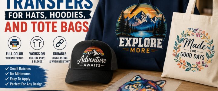
DTF Transfers For Hats, Hoodies, And Tote Bags

DTF Transfers For Hats, Hoodies, And Tote Bags

TLDR

DTF transfers for hats, hoodies, and tote bags are a practical way to make custom merch without ordering huge screen-printed runs.

They work well for full-color designs, small batches, brand logos, event merch, team apparel, and product launches. Hoodies and cotton tote bags are usually easier to press than hats because they have flatter surfaces. Hats can still work well, but they often need a cap press, curved platen, and smaller artwork.

For most small brands, DTF transfers are best when you want flexible quantities, detailed artwork, and a finished look without buying professional printing equipment.

DTF Transfers Make Custom Merch Easier To Start

DTF transfers for hats, hoodies, and tote bags solve a common small-business problem: you want custom apparel and accessories, but you do not want to commit to a huge order before you know what will sell.

That is where direct-to-film transfers make sense. A DTF transfer is a printed design made on a special film, backed with adhesive, and applied to fabric with heat and pressure. Instead of printing directly onto the item, you press the finished transfer onto the garment or bag.

This makes DTF useful for:

  • Small merch drops
  • Staff apparel
  • School spirit wear
  • Team hoodies
  • Event tote bags
  • Brand hats
  • Creator merch
  • Local business uniforms
  • Market booth products
  • Limited seasonal designs

The appeal is simple. You can test designs in smaller quantities, use full-color artwork, and decorate different products without setting up screens for every color.

Screen printing still makes sense for large runs of simple designs. Embroidery still looks great on many hats. But DTF transfers sit in a useful middle: detailed artwork, flexible quantities, and a clean finish when pressed correctly.

Why Use DTF Transfers For Hats, Hoodies, And Tote Bags?

Hats, hoodies, and tote bags are three of the most useful merch items because people actually use them.

A shirt might get worn once in a while. A hoodie can become part of someone’s regular rotation. A tote bag can carry groceries, books, market goods, or event materials. A hat can put your logo in front of people all day.

DTF transfers work well across these items because they can handle:

  • Full-color logos
  • Gradients
  • Small details
  • Illustrations
  • Mascots
  • Slogans
  • Event artwork
  • Limited-edition designs
  • Light or dark fabric colors

That flexibility matters for small brands. You can make a hoodie with a large back print, a tote with a bold front design, and a hat with a smaller logo using the same general artwork system.

A supplier like CustomStickers.com is useful here because you can order custom DTF transfers that are ready to press. You upload the artwork, choose the size, and use the transfers on compatible garments or fabric products.

That is much simpler than buying a DTF printer, ink, film, powder, curing equipment, and a full production setup.

DTF Transfers For Hoodies

Hoodies are one of the best products for DTF transfers because they have enough surface area for strong designs. A hoodie can hold a small left-chest logo, a sleeve detail, a large back print, or a full front graphic.

Good hoodie placements include:

  • Left chest logo
  • Center chest design
  • Large back print
  • Sleeve print
  • Small cuff detail
  • Hood print, when the shape allows it
  • Inside neck label, if using a small transfer

Hoodies do come with a few pressing challenges. The fabric is thicker than a T-shirt. Seams, pockets, drawstrings, and zippers can create uneven pressure. Uneven pressure is one of the main reasons transfers fail.

For best results, keep the print area flat. Move bulky seams off the press when possible. Use a heat press pillow or pressing pad when needed to raise the print area above seams and pockets.

For pullover hoodies, avoid placing a transfer too close to the front pouch pocket. That area can be hard to press evenly. For zip hoodies, avoid trying to press across the zipper. Split designs can work, but they require more care.

Best hoodie uses:

  • Streetwear-style merch
  • Team hoodies
  • Employee apparel
  • School spirit wear
  • Band merch
  • Creator merch
  • Coffee shop or restaurant apparel
  • Gym or fitness brand hoodies

Hoodies are also a good place to use larger designs, but be careful with big solid blocks of ink. DTF prints sit on top of the fabric, so a huge solid rectangle can feel heavier than a smaller, more open design.

DTF Transfers For Tote Bags

Tote bags are another strong fit for DTF transfers, especially cotton and canvas totes. They are flat, useful, and easy to brand.

Good tote bag placements include:

  • Center front logo
  • Large illustrated design
  • Small lower-corner logo
  • Event artwork
  • Brand slogan
  • Market booth graphic
  • Gift shop design
  • Sponsor or fundraiser logo

Totes are popular because they work for many groups:

  • Boutiques
  • Farmers markets
  • Bookstores
  • Coffee shops
  • Bakeries
  • Wedding welcome bags
  • Conferences
  • Nonprofits
  • School events
  • Artists and creators

Cotton and canvas totes are usually easier to press than hats because the surface is flat. The main thing is to pre-press the bag to remove moisture and wrinkles. A smooth surface helps the transfer bond better.

Also place a protective sheet or pressing pad inside the tote when needed. Some bags have seams, folds, or inner layers that can affect pressure. You do not want the two sides sticking together or pressure landing unevenly.

Non-woven polypropylene totes are trickier. These are the soft, reusable grocery-style bags that feel more like plastic fabric. They can be heat-sensitive, so they may need lower temperatures, shorter press times, and careful testing. Do not assume every tote bag material can take the same heat.

Best tote uses:

  • Event swag bags
  • Retail shopping bags
  • Artist merch
  • Branded gift bags
  • Market bags
  • Fundraiser bags
  • Welcome bags
  • Small business packaging

A tote bag is also a good first DTF product because the shape is forgiving. If the print area is flat and the fabric can handle the heat, the process is usually straightforward.

DTF Transfers For Hats

Hats can look great with DTF transfers, but they are less forgiving than hoodies or totes.

The challenge is the curve. A flat transfer has to bond to a curved surface. The front panel of the hat may also have seams, structure, foam, mesh, or uneven tension. If the transfer does not sit flush, corners can lift or the image can wrinkle.

For hats, smaller designs usually work best.

Good hat placements include:

  • Front center logo
  • Small side logo
  • Back strap area, when flat enough
  • Beanie front cuff
  • Trucker hat front panel
  • Simple patch-style artwork

Avoid large, detailed prints on curved hat panels unless you have the right press and experience. A small logo is much easier to apply cleanly than a wide graphic that wraps around the front of a cap.

For structured caps and trucker hats, a cap press with a curved platen is usually better than a flat heat press. It holds the hat shape and helps apply even pressure. Heat tape can help keep the transfer in place, but it should not wrinkle or pull the film out of alignment.

Beanies can also work, but knit fabric stretches. Use moderate pressure and avoid overstretching the surface before pressing. A design that looks straight on a stretched beanie may distort when the fabric relaxes.

Best hat uses:

  • Small business logo caps
  • Staff hats
  • Trucker hats
  • Beanies
  • Event caps
  • Creator merch
  • Club hats
  • Sports team fan gear

If hats are your main product, test a few blanks first. Different cap styles behave differently under heat.

Artwork Tips For Better DTF Results

Good DTF results start before the heat press. The artwork matters.

Use clean, high-resolution files. Avoid tiny text. Make sure the design has enough contrast against the garment color. If the design will go on black, navy, forest green, or another dark fabric, check that the colors still stand out.

Artwork tips:

  • Use transparent backgrounds when the design should not have a box around it.
  • Keep small text large enough to read from a few feet away.
  • Avoid thin lines that may disappear on textured fabric.
  • Size the design for the actual product, not just the screen.
  • Use stronger contrast for dark garments.
  • Test one item before pressing a full batch.
  • Keep hat designs simpler than hoodie or tote designs.
  • Leave room around seams, pockets, zippers, and handles.

A hoodie can handle more detail than a hat. A tote can handle a bold illustration. A cap usually needs a tighter logo or badge-style design.

Let the product shape guide the artwork.

How To Choose Sizes For Each Product

Sizing is one of the easiest places to make a mistake.

A design that looks normal on a hoodie may be huge on a hat. A logo that looks bold on a cap may look tiny on a tote.

Practical starting points:

  • Hats: small logos, usually compact and centered
  • Beanies: small to medium designs on the cuff
  • Hoodies: left chest logos, center chest graphics, or large back prints
  • Tote bags: medium to large centered designs
  • Sleeve prints: narrow vertical or horizontal artwork
  • Inside neck labels: very small transfers

Before ordering, print the design on paper at the intended size. Cut it out and place it on the blank product. This low-tech test works. It shows whether the design feels balanced before you spend money.

For a merch drop, create a consistent system. For example:

  • Small logo for hats
  • Medium logo for hoodie chest
  • Large design for hoodie back
  • Medium-large design for tote bags

That gives the line a connected look without forcing the same exact size onto every item.

Pressing Tips That Prevent Problems

Every transfer supplier should provide application instructions. Follow those first.

Still, a few general rules help:

  • Pre-press the item to remove moisture and wrinkles.
  • Use even pressure.
  • Keep seams and zippers away from the press area.
  • Use a pressing pillow when needed.
  • Let the transfer peel according to the supplier’s instructions.
  • Do a second press if recommended.
  • Test before production.
  • Adjust settings for heat-sensitive fabrics.

Cotton can usually handle more heat than polyester. Polyester and performance fabrics can be more sensitive to scorching, shine marks, and dye migration. Totes made from synthetic materials can be even more sensitive.

Hoodies need attention because the fabric is thick. Hats need attention because the surface is curved. Totes need attention because the material can vary.

The process is not hard, but it does reward patience.

Washing And Care

Care instructions help customers keep the print looking good.

For DTF-decorated apparel, a simple care card can say:

  • Wait 24 hours before the first wash.
  • Wash inside out.
  • Use cold water.
  • Use mild detergent.
  • Avoid bleach.
  • Avoid fabric softener.
  • Tumble dry low or air dry.
  • Do not iron directly on the print.

For tote bags, care depends on the material. Cotton totes may be washable, while some non-woven bags should be spot-cleaned instead. For hats, spot cleaning is often safer than machine washing, especially for structured caps.

Small brands should include care instructions with hoodie and tote orders. It reduces avoidable damage and makes the product feel more complete.

When DTF Transfers Are The Right Choice

DTF transfers are a good choice when you want:

  • Full-color artwork
  • Small or medium batches
  • Multiple product types
  • Dark garments
  • Detailed designs
  • Fast merch testing
  • Lower setup commitment
  • Flexible product launches

They may not be the best choice when:

  • You need thousands of the same simple design
  • You want embroidery texture on hats
  • You need an ultra-soft print on a large solid area
  • The product cannot handle heat
  • The design has very tiny text
  • You do not have a reliable heat press setup

For many small brands, DTF is a strong first step. You can test demand, build a merch line, and learn what customers actually buy before committing to larger production methods.

A Simple Starter Plan

Start with three products:

  1. A hoodie with a left chest logo and optional back print.
  2. A cotton tote bag with a centered front design.
  3. A cap or beanie with a small logo.

Use one design family across all three. Do not make every item completely different at first. Keep the colors, logo, and style consistent.

Order a small transfer batch, press samples, take product photos, and test sales. If the hoodie sells but the hat does not, you learned something. If the tote gets the most interest, order more. That is the advantage of DTF transfers: you can adjust without being stuck with a huge inventory mistake.

Final Thoughts

DTF transfers for hats, hoodies, and tote bags give small brands a practical way to make custom merch without overcommitting. Hoodies give you room for bold designs. Tote bags are useful, flat, and easy to brand. Hats are great for logos, but they need more careful pressing because of the curve.

The best results come from matching the design to the product. Use simple, compact artwork for hats. Use stronger graphics for hoodies and totes. Test blank materials before making a full batch. Follow the transfer supplier’s pressing instructions.

For creators, restaurants, boutiques, teams, schools, and local brands, DTF transfers can make merch feel much more accessible. You can start small, learn what sells, and grow the line from there.

And for ready-to-press transfers, CustomStickers.com offers a straightforward way to order custom DTF transfers without buying the full printing setup yourself.

How to Design a Product Label

How to Design a Product Label

TLDR

A good product label tells customers what the product is, who made it, what they need to know, and why it is worth picking up.

Start with the package size, product category, required information, and customer expectations before choosing fonts, colors, and artwork. The best product labels are clear at a glance and easy to read at the final printed size.

For polished labels, small businesses can order custom product labels instead of trying to manage label printing at home.

Start With the Job of the Label

A product label has to do several things at once.

It needs to identify the product. It needs to show the brand. It needs to explain the most important details. It may need to include ingredients, warnings, size, flavor, scent, barcode, batch number, directions, or business information. And it has to do all of that on a small piece of packaging without looking crowded.

That is why learning how to design a product label is less about making something pretty and more about making something clear.

Good design still matters. A label should look appealing. But if the customer cannot tell what the product is, what size it is, or why it belongs in their cart, the label is not doing its job.

Start with clarity. Style comes after.

Know the Product Before You Design

Before you open Canva, Illustrator, Photoshop, Procreate, or any label design tool, look at the product itself.

The label for a candle jar is different from the label for a coffee bag. A hot sauce bottle is different from a skincare tube. A bakery box is different from a supplement container. The shape, material, surface, and product category all affect the label.

Ask these questions first:

  • What container or package will the label go on?
  • Is the surface flat, curved, textured, glossy, or flexible?
  • Will the product get wet, cold, oily, warm, or handled often?
  • Will the product sit on a shelf, ship in a box, or sell at a market booth?
  • Does the product need ingredients, warnings, directions, or regulatory information?
  • Will the label be applied by hand or with a label dispenser?
  • Do you need one design or several variations?

This step prevents a common mistake: designing a label that looks good on screen but does not fit the actual package.

Print the label at the final size on plain paper. Cut it out. Tape it to the product. If the label looks awkward, wraps too far, hides on the shelf, or becomes hard to read, fix it before ordering.

Decide What Information Belongs on the Label

A strong product label does not include every possible detail on the front.

It includes the right details in the right place.

For most products, the front label should answer the customer’s first questions quickly:

  • What is this?
  • Who made it?
  • What flavor, scent, color, or version is it?
  • How much product is included?
  • What is the main reason to care?

A candle front label might include the brand name, scent name, wax type, and net weight.

A coffee bag label might include the brand, roast name, tasting notes, roast level, weight, and grind type.

A skincare label might include the product name, purpose, volume, and a short benefit statement.

A food label may need more required information depending on the product and where it is sold. That can include identity, net quantity, ingredients, allergens, nutrition information, and business details. Cosmetics, supplements, alcohol, children’s products, and other regulated categories may also have specific labeling rules.

This is not legal advice. It is a practical design reminder: if your product category has labeling rules, check those rules before printing a large batch.

A label that looks good but leaves out required information can create bigger problems later.

Build a Simple Label Hierarchy

Hierarchy means the order in which someone sees information.

On a product label, everything should not be the same size. If every word is bold, nothing is bold. If every line competes for attention, the customer has to work too hard.

Most product labels should have a clear order:

  1. Brand name or logo
  2. Product name
  3. Variant, flavor, scent, or style
  4. Key details
  5. Required information
  6. Small supporting text

The product name should usually be easy to find. The variant should be clear. Required information should be readable, even if it is smaller.

For example, a jam label might use:

  • Brand: Meadow Creek Preserves
  • Product: Strawberry Jam
  • Variant: Small Batch
  • Detail: Made with real strawberries
  • Required info: Net wt. 8 oz, ingredients, business information

A customer should not have to rotate the jar five times to understand what it is.

Choose the Right Label Shape

Label shape should match the package and the amount of information you need to include.

Circle labels are great for jar lids, candle lids, bakery boxes, seals, and simple logo labels. They work best when the design is short and centered.

Rectangle labels are the most practical shape for bottles, jars, pouches, boxes, and products with more information. They give you room for product names, ingredients, directions, and barcodes.

Square labels feel clean and modern. They work well for candles, coffee bags, soap boxes, jars, and boutique products.

Oval labels can feel softer and more traditional. They work well for handmade foods, bath products, jars, honey, candles, and gift packaging.

Die cut labels follow a custom shape. They are useful for logos, illustrated labels, mascots, badges, and products that need a more distinctive look.

Clear labels work well on glass, jars, bottles, candles, and minimalist packaging. They can look very clean, but contrast matters. Dark text on a dark product or light text on a pale product can disappear fast.

CustomStickers.com offers custom labels in several formats, including roll labels, sheet labels, clear labels, matte labels, gloss labels, and common shapes like circle, square, rectangle, oval, and die cut. That makes it easier to match the label format to the package instead of forcing one generic shape onto every product.

Pick Colors That Fit the Product and Stay Readable

Color does a lot of work on a label.

It can suggest flavor, scent, mood, price point, audience, or category. But color also has to support readability.

A few practical examples:

  • Lavender or soft purple can make sense for a lavender candle or bath product.
  • Deep red can work for hot sauce, wine, or berry preserves.
  • Green can suggest herbal, natural, mint, matcha, or plant-based products.
  • Black and white can feel clean, bold, or premium when used carefully.
  • Kraft brown and cream can support handmade, organic, bakery, or rustic products.

But do not choose color only because it looks good in a mood board. Test it on the actual package.

A pale yellow label on a clear bottle filled with light oil may be hard to see. Thin white text on a pastel background may look elegant on screen and unreadable in person. A dark label on a dark jar may lose all edge definition.

Use contrast. Make the product name easy to read. Keep required information legible.

Use Fonts Carefully

Fonts can make or break a product label.

The safest approach is to use one font for the main product name and one supporting font for smaller details. You can use more, but you need a reason.

Good label typography is:

  • Easy to read
  • Consistent
  • Properly spaced
  • Large enough at final size
  • Matched to the product personality
  • Not too decorative for important details

Script fonts can look nice for candles, wedding favors, handmade goods, and boutique products. But they are risky for ingredients, directions, net weight, warning labels, and small text.

Use decorative fonts for personality. Use clean fonts for information.

A label can have style without making the customer squint.

Design for the Actual Printed Size

This is one of the most important parts of product label design.

A label design on a computer screen is not the same as a printed label on a two-inch jar. Details shrink. Thin lines disappear. Small text becomes hard to read. QR codes stop scanning. Fine borders may look uneven if they sit too close to the cut line.

Before ordering labels, check the design at actual size.

Look for:

  • Product name readability
  • Small text readability
  • Enough margin around the edge
  • Proper spacing between elements
  • QR code scannability
  • Barcode size and contrast
  • Logo clarity
  • Color contrast
  • Whether the shape fits the package

Print a rough version at home on regular paper. It does not need to be color-perfect. You are checking size, layout, and readability.

If the design feels cramped, remove something. Most weak labels have too much information, not too little.

Choose the Right Material and Finish

Label material affects durability, texture, and how the finished product feels.

For dry indoor products, a standard label material may be enough. For products that may face moisture, oils, refrigeration, handling, or spills, you need a more durable material or laminate.

Think about the product environment:

  • Candle labels may face handling, warmth, and oils.
  • Beverage labels may face moisture or refrigeration.
  • Bath and beauty labels may face water, oils, and frequent touch.
  • Food jar labels may face condensation, kitchen handling, or refrigeration.
  • Shipping labels need to stay readable through transit.
  • Retail labels need to look clean on the shelf.

Gloss labels can make colors feel brighter and more saturated. Matte labels feel softer and more understated. Clear labels can make packaging look minimal and clean. Laminated labels can add protection against moisture, scratches, and wear.

The best finish is not always the fanciest one. It is the one that fits the product, brand, and use case.

Make Product Variations Easy to Tell Apart

Many brands sell several versions of the same product.

That might mean different candle scents, coffee roasts, sauce heat levels, soap varieties, tea blends, skincare formulas, sizes, flavors, or seasonal editions.

A good label system makes these variations easy to recognize.

You can separate product variations with:

  • Color bands
  • Flavor names
  • Scent names
  • Small icons
  • Pattern changes
  • Numbering systems
  • Lid labels
  • Accent colors
  • Simple illustrations

Keep the core brand structure consistent. Change only what needs to change.

For example, a candle brand might keep the same logo, layout, font, and label shape across every scent. Only the scent name and accent color change. That makes the line feel cohesive while still helping customers find the version they want.

Consistency builds trust. Clear variation helps customers buy faster.

Think About Shelf Impact

A label should work up close and from a short distance.

At a market, retail store, or event booth, customers may first see the product from several feet away. They may not read the small details until after the label catches their eye.

This does not mean the label needs to be loud. It means the main idea should be visible.

A strong shelf label usually has:

  • A clear product name
  • Strong contrast
  • A readable brand mark
  • Enough white space
  • A distinct shape or color
  • A simple visual cue
  • No unnecessary clutter

If your label sits next to five similar products, what helps yours make sense quickly?

That question is more useful than asking, “Does this look cool?”

Add Trust Details Without Crowding the Design

Small trust cues can help customers feel more confident, but they need to be accurate.

Useful trust details may include:

  • Batch number
  • Net weight or volume
  • Ingredients
  • Directions
  • Business location
  • Website
  • QR code
  • Care instructions
  • Safety warning
  • Use-by date
  • Handmade or small-batch note
  • Recyclable packaging note, if accurate
  • Made in USA claim, if accurate and supportable

Be careful with claims. Do not add “organic,” “non-toxic,” “eco-friendly,” “Made in USA,” “waterproof,” “FDA approved,” or similar statements unless they are true and supported.

Labels carry trust. Do not use that space carelessly.

Prepare the File for Printing

Once the label design is finished, prepare the file properly.

Before sending the file to print, check:

  • Correct label size
  • High-resolution artwork
  • Clean logo file
  • Proper bleed, if required
  • Safe margins around text
  • Transparent background, if needed
  • Correct spelling
  • Correct product name
  • Correct scent, flavor, or variant
  • Correct net weight or volume
  • Correct ingredients or required information
  • Correct barcode or QR code
  • Correct color mode or export settings, based on printer requirements

If your printer provides a proof, review it carefully. Do not just glance at it.

Check the cut line. Check the margins. Check spelling. Check the label size. Check whether the design is centered. Check every number.

A proof is where you catch problems before they become boxes of unusable labels.

When to Order Professional Product Labels

Home printing can work for testing. It can also work for tiny batches, prototypes, personal projects, and very early product ideas.

But once you are selling products, professional labels usually make more sense.

Professional product labels are useful when:

  • You need consistent color
  • You need larger quantities
  • You want roll labels for faster application
  • You need durable materials
  • You want matte, gloss, clear, or die cut options
  • You are selling at markets, retail stores, or online
  • You want the package to look polished
  • You do not want to fight with printer alignment

For small businesses, custom labels are a practical option because you can choose roll or sheet labels, select common shapes, and review a proof before printing. That proofing step is especially helpful for product labels because small errors can affect every item in a batch.

A well-printed label does not replace a good product. But it does help the product feel ready.

Common Product Label Mistakes to Avoid

The most common mistake is trying to put too much on one label.

Other mistakes include:

  • Designing before measuring the package
  • Using tiny text
  • Choosing low-contrast colors
  • Using too many fonts
  • Forgetting required product information
  • Making unsupported claims
  • Putting text too close to the edge
  • Using low-resolution artwork
  • Forgetting to test the label at actual size
  • Making product variations hard to tell apart
  • Choosing the wrong material for moisture, oil, or handling
  • Approving a proof too quickly

A label does not need to be complicated to look professional. It needs to be clear, accurate, readable, and suited to the package.

Product Label Design Checklist

Before ordering labels, confirm:

  • The label fits the package.
  • The product name is easy to read.
  • The brand name or logo is clear.
  • The product variant is obvious.
  • Required details are included.
  • Small text is readable at final size.
  • Colors have enough contrast.
  • The material fits the product environment.
  • The finish matches the brand style.
  • The design has enough margin.
  • The barcode or QR code works.
  • Claims are accurate.
  • Spelling has been checked.
  • The proof has been reviewed carefully.

This checklist is simple. It also prevents many expensive mistakes.

Conclusion

Designing a product label starts with the product, not the artwork.

Measure the package. Decide what information needs to be included. Build a clear hierarchy. Choose a shape, material, and finish that match the product’s use. Then test the design at actual size before ordering.

A strong label helps customers understand the product quickly. It also makes the package feel more finished, more trustworthy, and easier to recognize.

The best product labels are not always the loudest. They are the clearest.

CustomStickers.com vs Rockin Monkey: Which Is Better For Custom Stickers?

The Short Take

CustomStickers.com vs Rockin Monkey is not really a normal head-to-head anymore. Rockin Monkey’s official site now says Rockin Monkey has joined Sticker Mule, so shoppers looking for Rockin Monkey are being directed into the Sticker Mule ecosystem.

That makes the practical verdict simple: if you want to order custom stickers directly from an active sticker specialist with strong quality, pricing, proofing and support, CustomStickers.com is the better choice.

Rockin Monkey had a strong reputation for sticker quality when orders went right. CustomStickers.com is the better option now because it is easier to recommend, easier to order from and much stronger overall in our current comparison.

The Scorecard

CategoryWinnerWhy
Current Ordering ClarityCustomStickers.comRockin Monkey now points shoppers to Sticker Mule
Sticker QualityCustomStickers.comRockin Monkey had strong quality history, but CustomStickers.com is stronger overall
Price And ValueCustomStickers.comMuch better value score in our matrix
Customer ServiceCustomStickers.comRockin Monkey scored poorly on service and operations
TurnaroundCustomStickers.comRockin Monkey had major turnaround issues in our notes
Best OverallCustomStickers.comClearer active choice for custom stickers

This one is less “which is better?” and more “which one can you confidently use today?”

What Happened To Rockin Monkey?

Rockin Monkey was known by many artists and sticker buyers as a quality-focused sticker printer. The good version of the Rockin Monkey story was strong: thick vinyl, nice color, durable stickers and a following among creators who cared about how the final sticker looked.

But the operational side became a problem in our notes. Rockin Monkey scored well for quality, but very poorly for price, service and turnaround. The issue was not “Can Rockin Monkey make a good sticker?” The issue was whether customers could rely on the ordering experience.

As of this update, Rockin Monkey’s own site says it has joined Sticker Mule and points users toward Sticker Mule products. That changes the comparison. You are no longer really choosing between CustomStickers.com and an independent Rockin Monkey order experience.

You are choosing CustomStickers.com or a Rockin Monkey-branded path into Sticker Mule.

Where CustomStickers.com Wins

CustomStickers.com is active, clear and easy to recommend. It offers durable vinyl stickers, free online proofs, free U.S. shipping, custom shapes and a proofing process that lets customers approve or request changes before printing.

That matters because sticker buying should not feel like detective work. You should not need to wonder whether the company is still taking orders, where the order is going, who is printing it or how long it will take. The sticker world has enough chaos already. Someone is always asking for holographic kiss-cut sheets by Friday.

CustomStickers.com gives buyers a cleaner path: upload art, get a proof, approve it and receive stickers.

Quality: Rockin Monkey Had A Case, But CustomStickers.com Is Safer

Quality is the one place where Rockin Monkey deserves respect.

Our internal notes say Rockin Monkey could produce excellent stickers when orders were completed. The print quality, vinyl feel, color and durability were often strong. That is why it had fans.

But quality does not help much if the ordering experience is unreliable. A perfect sticker that arrives too late for the event is just a souvenir of your frustration.

CustomStickers.com also scores at the top for quality, but it pairs that quality with better pricing, service and turnaround. That is the difference. Rockin Monkey had quality upside. CustomStickers.com has a better overall system.

For customers, the system matters.

Price And Value: No Contest

CustomStickers.com wins on value.

In our sticker matrix, CustomStickers.com scores at the top for price and overall average. Rockin Monkey scores near the bottom overall, with weak marks for price, service and turnaround.

That makes this comparison unusually straightforward. Even if Rockin Monkey’s quality was strong historically, CustomStickers.com gives buyers a better total package: premium vinyl stickers, free proofs, free shipping and more dependable ordering.

Good sticker quality is not enough by itself. The final value comes from quality, price, turnaround and support working together.

CustomStickers.com has that balance. Rockin Monkey did not.

Customer Service And Turnaround

This is where Rockin Monkey struggled the most in our notes. The brand had serious operational concerns, including very long turnaround times, delayed orders and poor communication.

The current official Rockin Monkey page now directs people to Sticker Mule, which may solve some of those problems under a different operation. But it also means Rockin Monkey is no longer the same independent option people may remember.

CustomStickers.com is much easier to recommend because its offer is clear. Free online proofs. Free shipping. Active product pages. Direct custom sticker ordering. Strong internal scores for service and turnaround.

No mystery. No “are they still taking orders?” energy. Just stickers.

Ordering Experience

CustomStickers.com has a normal, clear sticker ordering flow. Choose your sticker type, select size and quantity, upload artwork, review the proof and approve.

Rockin Monkey’s current ordering path is not really Rockin Monkey anymore. The official site says it has joined Sticker Mule and encourages shoppers to try Sticker Mule or browse products there.

That may be fine for customers who want Sticker Mule. But if the search is specifically for CustomStickers.com vs Rockin Monkey, CustomStickers.com wins because it remains a clear direct choice.

It is hard to beat a company that is actually available in its own lane.

Best Use Cases

Choose CustomStickers.com for:

  • Custom vinyl stickers
  • Die-cut logo stickers
  • Waterproof stickers
  • Artist merch
  • Laptop and water bottle stickers
  • Event stickers
  • Packaging stickers
  • Repeat business orders
  • Clear proofing and direct ordering

Choose Rockin Monkey only if:

  • You specifically remember the old brand and want to follow its current path to Sticker Mule
  • You are researching historical sticker company comparisons
  • You are comparing legacy artist-favorite sticker printers

For actual custom sticker ordering today, CustomStickers.com is the practical pick.

Pros And Cons

CustomStickers.com Pros

  • Active sticker specialist
  • Excellent overall sticker score
  • Strong quality and durability
  • Better price and value
  • Free online proofs
  • Free U.S. shipping
  • Stronger service and turnaround scores
  • Clear ordering process

CustomStickers.com Cons

  • Not as much old-school indie sticker lore as Rockin Monkey
  • Fewer ultra-niche legacy artist-shop vibes
  • Best for customers who want a direct modern ordering flow

Rockin Monkey Pros

  • Historically strong sticker quality
  • Good reputation among some artists when orders went right
  • Now connected to Sticker Mule’s production and support ecosystem

Rockin Monkey Cons

  • No longer a clear independent ordering choice
  • Official site points shoppers to Sticker Mule
  • Poor service and turnaround scores in our matrix
  • Operational issues made it hard to recommend
  • Weak overall value compared with CustomStickers.com

Final Verdict

Rockin Monkey had a real quality reputation, and it is fair to acknowledge that. But the current comparison is not close.

CustomStickers.com is the better choice for custom stickers today. It is active, clear, affordable, proof-based and strong across the full buying experience. Rockin Monkey’s own site now points shoppers to Sticker Mule, which makes it less of a direct competitor and more of a legacy brand name.

In this CustomStickers.com vs Rockin Monkey comparison, CustomStickers.com wins on current availability, value, customer service, turnaround and overall confidence.

Where To Find Inspiration For Artist Stickers And Decals

Where To Find Inspiration For Artist Stickers And Decals

TLDR

  • The best inspiration for artist stickers and decals comes from Etsy, Pinterest, TikTok, Instagram, eBay, Redbubble and boutique sticker shops.
  • Use artist marketplaces when you want finished designs from independent creators.
  • Use eBay for vintage sticker packs, retro decals, old-school typography and collector-style ideas.
  • Use CustomStickers.com when you have your own artwork and want to turn your idea into custom vinyl stickers.
  • For a fun Etsy-style starting point, look at shops like Claw and Order Stickers on Etsy for playful, personality-driven sticker inspiration.

Sticker ideas are everywhere once you start noticing them. A laptop covered in tiny ghosts, an old skateboard decal, a planner sticker with one perfect phrase, a hand-drawn cat doing something suspiciously dramatic. That is the fun of artist stickers and decals: they are small, but they carry a ton of personality.

The best place to find inspiration for artist stickers and decals is not one single website. It is a mix of artist marketplaces, visual search platforms, social media, vintage resale sites and custom printing shops. Some places are better for finished sticker art. Others are better for color palettes, formats, niche humor, old-school design ideas or custom vinyl sticker production.

Here is where to look, what each platform is best for and how to turn a spark of inspiration into a sticker people actually want to peel, stick and keep.

Start With Artist Marketplaces For Finished Sticker Ideas

Artist marketplaces are a great first stop because they show you what real artists are making and what buyers are actually searching for. You can browse by style, theme, fandom, phrase or surface type. That gives you a quick feel for what is popular without needing to copy anyone’s work.

Redbubble is one of the biggest places to browse independent artist stickers. It is especially useful for niche ideas. Search for things like “retro frog sticker,” “botanical laptop sticker,” “bookish decal,” “camping sticker art” or “funny raccoon vinyl sticker.” You will see patterns fast: bold outlines, clean silhouettes, soft pastel color palettes, tiny text jokes and hand-drawn animals all show up often.

Society6 leans more art-forward. It is useful when you want sticker inspiration that feels closer to wall art, illustration or home decor. Browse it for abstract shapes, floral decals, line art, painterly textures and color combinations that feel more polished than meme-based.

TeePublic is good for pop-culture energy, indie fandoms and playful graphic design. The designs often feel bold, readable and built for quick recognition. That makes it helpful if you are designing stickers for laptops, water bottles, notebooks, helmets or sticker-bomb packs.

The trick with these marketplaces is to study the pattern, not the exact design. Look at what makes a sticker work. Is the shape easy to read? Does the border help it pop? Is the joke clear in two seconds? Does the design still make sense at three inches wide? Those questions are more useful than copying a cute drawing.

Browse Etsy Shops And Boutique Sellers For Handmade Style

Etsy is still one of the best places to find handmade stickers, custom decals, small-batch sticker sheets and artist-run shops. The charm is the variety. One shop might sell cozy planner stickers. Another might sell spooky cat decals, hand-lettered bumper stickers or holographic vinyl stickers for water bottles.

For a more boutique feel, check out shops like clawandorderstickers on Etsy. Shops like this are useful inspiration because they tend to have a stronger point of view than generic sticker packs. You can often see a clear personality in the product names, illustration style, packaging choices and photo setup.

Etsy is also one of the better places to study product presentation. Look at how sellers photograph sticker sheets. Notice whether they show the sticker on a laptop, in a journal or next to a hand for scale. Product photos can give you ideas for your own listings, especially if you plan to sell stickers online.

Good Etsy searches for inspiration include:

  • cute vinyl stickers
  • funny laptop decals
  • hand drawn sticker sheet
  • holographic stickers
  • planner sticker art
  • cat sticker shop
  • custom name decals
  • car window vinyl decal

Etsy is also helpful when you need a specific style. Want soft cottagecore mushrooms? Done. Want chaotic raccoon humor? Probably yes. Want a custom decal for a tumbler, car window or storefront? Etsy has plenty of sellers who handle that too.

Just keep the creative line clean. Use Etsy for inspiration, not imitation. The best artists borrow broad cues like format, tone, color and theme, then make the idea their own.

Use Pinterest, TikTok And Instagram To Spot Styles Early

Pinterest is a mood board machine. It is especially helpful for visual clustering. Search “sticker art inspiration,” “aesthetic sticker designs,” “kawaii sticker sheet,” “retro decal design” or “vinyl sticker ideas,” then save the designs that catch your eye. After 20 to 30 saves, patterns will start to appear.

You might notice you keep saving:

  • thick white borders
  • soft pastel animals
  • black-and-white line art
  • tiny food characters
  • vintage travel decals
  • sticker sheets with matching mini icons
  • bold typography stickers
  • playful phrase stickers

That is your style map. It tells you what you are drawn to before you overthink it.

TikTok and Instagram are better for process inspiration. Search hashtags like #stickerart, #stickershop, #stickerbusiness, #stickerartist, #stickersheet and #vinylstickers. You will see artists sketching designs, packing orders, testing finishes, peeling sticker sheets and showing what sells at markets.

These platforms are great because they show the human side of stickers. You see what people comment on. You see which designs get picked up, handled, peeled or bought in multiples. That is useful because stickers are physical objects. A design may look nice on a screen, but a great sticker also feels fun to use.

Check eBay For Vintage Sticker And Decal Inspiration

eBay is underrated for sticker inspiration. It is not just a place to buy random sticker lots. It is a giant archive of vintage stickers, old decals, discontinued packs, skate graphics, travel stickers, promotional labels and collector sheets.

Search eBay for terms like:

  • vintage sticker pack
  • 80s stickers
  • 90s sticker sheet
  • vintage skateboard stickers
  • travel decals
  • retro vinyl decals
  • old bumper stickers
  • collectible sticker lot

This is where you find older design language that is not shaped by current social media trends. Vintage sticker packs often use chunkier lettering, bright color blocking, simple mascots, chrome effects, airbrushed gradients or goofy slogans. Some of it feels charming because it is not overly polished.

eBay is also useful for studying themes that keep coming back: surf culture, skate brands, travel badges, school reward stickers, vending machine stickers, band decals and car window graphics. These older references can help you make new stickers that feel nostalgic without copying a specific piece.

A simple exercise: find five vintage stickers you like on eBay and write down what you like about each one. Do not write “the whole thing.” Be specific. Maybe it is the bubble letters, color palette, starburst shape, mascot pose or tiny border detail. Those notes become ingredients for your own design.

Turn Inspiration Into Custom Vinyl Stickers

Once you have a design idea, you need to decide whether you are buying finished stickers or making your own. This is where CustomStickers.com is worth putting on your shortlist.

CustomStickers.com is a strong choice when you already have artwork, a logo, a character, a quote or a small collection of designs ready to print. It is especially useful for custom vinyl stickers, die cut stickers, sticker sheets, waterproof stickers and decals that need to hold up on laptops, water bottles, packaging, helmets or car windows.

This is a different kind of inspiration source. Marketplaces like Etsy, Redbubble and eBay help you see what exists. CustomStickers.com helps you make your own version real.

Before ordering, think through four practical details:

Surface

Where will the sticker go? A laptop sticker, car decal, wall decal and packaging sticker do not all need the same material or finish. Outdoor decals need more durability than a journal sticker.

Shape

A die cut sticker follows the shape of the artwork. A kiss cut sticker stays on a backing sheet and is easier to peel. Sticker sheets are great when you have a set of related designs.

Finish

Matte feels softer and photographs well. Gloss feels bright and punchy. Holographic, clear or specialty finishes can make a simple design feel more fun, but they work best when the artwork is clean.

Size

Tiny stickers are cute, but small text can disappear fast. If your sticker has words, print a test at actual size before ordering a full batch.

This step is where many good ideas become better. A sticker design should not just look cute on a monitor. It should read clearly, peel cleanly and feel right in someone’s hand.

Use A Simple Inspiration Framework

When you feel stuck, use this four-part framework:

Subject: What is the sticker about? A cat, mushroom, phrase, logo, flower, ghost, sandwich or tiny wizard?

Style: What is the visual approach? Cute, vintage, minimalist, hand-drawn, bold, painterly, spooky, cozy or sarcastic?

Surface: Where does it live? Laptop, water bottle, phone case, car window, wall, planner, packaging or shipping mailer?

Finish: What makes it feel complete? Matte vinyl, glossy vinyl, holographic film, clear vinyl, sticker sheet layout or a die cut shape?

Here is an example. Say the subject is a raccoon. The style is vintage camping patch. The surface is a water bottle. The finish is matte die cut vinyl. Suddenly “raccoon sticker” becomes a much clearer idea: a little trash-loving camp mascot with bold lines, warm colors and an outdoor-friendly finish.

That is much easier to design, sell or print.

Best Places To Look By Goal

If you want finished art, start with Redbubble, TeePublic, Society6 and Etsy.

If you want handmade or boutique sticker shop ideas, start with Etsy and look for shops like clawandorderstickers on Etsy.

If you want vintage inspiration, search eBay for sticker lots, retro decals and collectible sticker sheets.

If you want design direction, build Pinterest boards around specific sticker styles.

If you want behind-the-scenes process ideas, search TikTok and Instagram sticker hashtags.

If you want to print your own stickers, use CustomStickers.com for custom vinyl stickers, die cut stickers and sticker sheets.

The cheerful little secret is that you do not need to find one perfect source. The best sticker ideas usually come from mixing sources. A vintage eBay color palette, a Pinterest layout, an Etsy-style sense of humor and a clean custom print can become something that feels fresh.

FAQs

Where Can I Find Inspiration For Artist Stickers And Decals?

Start with Etsy, Pinterest, TikTok, Instagram, Redbubble, TeePublic, Society6, eBay and CustomStickers.com. Each platform gives you a different kind of inspiration, from handmade sticker shops to vintage decal references and custom printing ideas.

Is Etsy Good For Sticker Inspiration?

Yes. Etsy is one of the best places to find handmade stickers, boutique decal shops, custom lettering, sticker sheets and small artist brands. Shops like clawandorderstickers on Etsy can help you see how a focused sticker shop builds personality around a specific style.

Why Use eBay For Sticker Ideas?

eBay is great for vintage sticker packs, old decals, collectible sticker sheets and retro design references. It can help you find older typography, color palettes and formats that feel different from current social media trends.

Where Should I Print My Own Artist Stickers?

CustomStickers.com is a good option if you have your own artwork and want custom vinyl stickers, die cut stickers, waterproof stickers or sticker sheets. It is especially helpful when you want your inspiration turned into a finished physical product.

What Makes A Sticker Design Work?

A strong sticker design is easy to read, clear at a small size and matched to the right surface. Good artwork matters, but so do the shape, border, finish, material and size.

Should I Copy Sticker Designs I Find Online?

No. Use online designs for inspiration, not copying. Study broad ideas like color, finish, layout, subject matter and product photography. Then create something original.

Conclusion

Artist stickers and decals are fun because inspiration can come from almost anywhere. Etsy gives you handmade charm. Pinterest helps you build a visual direction. TikTok and Instagram show the creative process. eBay opens the door to vintage sticker history. Redbubble, Society6 and TeePublic show what independent artists are making right now. And CustomStickers.com helps turn your own idea into a real sticker people can use.

Start with a few searches, save what catches your eye and look for patterns. The more specific your inspiration gets, the easier it is to create something that feels personal, polished and ready to stick somewhere good.