Print Embellishment for Direct Mail

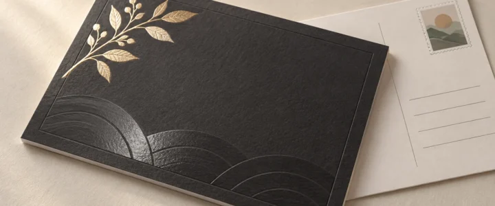
Black textured stationery card with a gold-foil botanical branch and subtle embossed wave pattern, resting over a cream postcard with blank address lines and a decorative landscape stamp illustration.

TLDR: Print embellishment for direct mail is worthwhile when it gives the recipient a useful visual or tactile cue: a foil headline that establishes hierarchy, a raised coating that invites touch, an embossed mark that adds quiet depth, or a paper surface that makes the entire piece feel considered. Pick one primary effect, keep the offer easy to read, proof it at actual size, and have the completed mail format checked against current postal requirements.

The best embellishment is not necessarily the shiniest one. It is the effect that supports what the mailpiece needs to communicate and survives the practical business of being printed, folded, addressed, sorted, and handled. A postcard promoting a limited-time offer has different needs from an envelope-enclosed invitation or a folded brand introduction.

What counts as print embellishment for direct mail?

An embellishment is an effect added beyond the base printed image. The category includes foil stamping, digital foil, UV coatings, embossing, film lamination, laser cutting, and other decorative processes. The Foil & Specialty Effects Association provides a useful overview of these processes in its specialty-effects design resources.

Paper choice belongs in the same decision even though stock is not technically a post-print embellishment. Texture, stiffness, coating, color, and opacity affect every square inch of a mailpiece. In many cases, moving from an ordinary smooth sheet to an intentional uncoated or textured stock produces a more coherent result than adding a small decorative flourish.

Keep the layers conceptually separate: stock is the material; ink or toner creates the base image; a coating or laminate changes the surface; foil adds a reflective element; and embossing, debossing, or letterpress physically changes the sheet. That distinction helps when requesting estimates and building artwork.

Compare visual and tactile effects

Option What changes Good uses Main cautions
Foil stamping or flat digital foil Reflective color and sharp visual contrast Logos, short headlines, borders, small focal details Fine elements and registration need production review; glare can reduce readability
Raised digital foil Reflective color plus a dimensional surface Premium marks, patterns, seals, restrained display type Added relief may be unsuitable near folds or mail-processing areas
Spot UV Localized gloss contrast against a less reflective surface Patterns, photos, large lettering, subtle brand details Contrast can disappear under flat lighting; dark areas may show handling marks
Raised or profile UV Gloss plus noticeable surface height Large shapes, textures, selective graphic accents Tiny details and fold placement require provider-specific testing
Embossing or debossing Paper is shaped upward or downward Monograms, seals, uncomplicated logos, quiet typography Reverse-side show-through and stock suitability must be considered
Letterpress A printed or blind impression in the paper Short copy, line art, invitation-style cards, restrained designs Not every stock accepts an impression equally; dense layouts can become visually busy
Lamination A film changes protection, feel, and surface appearance Frequently handled pieces and designs needing a uniform finish Can alter fold behavior, recyclability assumptions, writability, and compatibility with later effects
Textured or cotton stock Changes the character of the whole printed surface Minimal layouts, personal messages, invitation-style mail Texture may soften fine detail and affect large solids or photographic reproduction

Foil: strongest when used as hierarchy

Foil earns its place when reflectivity directs attention to something important: a name, date, logo, short promise, or response cue. It becomes less useful when every border, icon, and line of text receives the same treatment. If everything flashes, nothing leads.

The production method also matters. FSEA explains that toner-based digital foil bonds foil to toner using heat, while polymer-based systems can first apply a raised polymer to create dimensional foiled areas. These are not interchangeable results, so ask whether the quoted effect is flat or raised and request process-specific artwork instructions.

Spot UV: contrast first, texture second

Conventional spot UV is primarily a selective shine treatment. It can reveal a pattern as the piece moves through the light without introducing another ink color. Raised or profile UV uses greater coating height to create a more tactile or embossed-looking result. FSEA distinguishes spot and flood UV approaches from raised or profile applications that add texture.

Use ordinary spot UV when gloss contrast is the point. Choose a raised version only when the physical profile adds something meaningful. A raised coating on every decorative element can make a piece feel more like a product sample than a clear sales message.

Embossing, debossing, and letterpress: quieter depth

These effects depend on light and shadow rather than metallic reflection. Embossing lifts an area, while debossing presses it down. Letterpress commonly combines ink with an impression, although a blind impression can omit the ink. They work especially well for uncomplicated marks and short lines because the physical form remains legible without competing with paragraphs of copy.

Stock selection is central here. A paper that looks substantial on a specification sheet may not produce the desired impression, and a deep effect may show on the reverse. If the reverse carries essential terms, an address, or a clean photograph, review both sides rather than approving the glamorous side and hoping for the best.

Choose the effect by the design goal

Start with what the embellishment must accomplish. This avoids the expensive habit of choosing a process first and inventing a reason afterward.

  • For immediate visual hierarchy, use a restrained foil element or strong gloss contrast.
  • For touch, consider raised UV, embossing, debossing, letterpress, or a distinctive uncoated stock.
  • For quiet character, let paper texture and typography do most of the work.
  • For handling protection, investigate an appropriate coating or laminate rather than treating decoration as durability.
  • For photographic impact, prioritize a surface that supports the image before adding a competing tactile effect.
  • For a handwritten response area, preserve an uncoated, writable surface and verify pen compatibility on the actual stock.

A stock upgrade is often the better choice when the design is minimal, the piece will be held for more than a moment, or the message depends on warmth rather than spectacle. Our guide to choosing cardstock for cards and postcards explains why the right stock changes with use. If weight terminology is clouding the decision, remember that GSM, basis weight, and point thickness describe different properties; see the cardstock paper-weight explainer rather than relying on a universal conversion chart.

Match the embellishment to the mail format

Postcards

A postcard has no envelope to protect its surface, and one side must perform the unromantic but essential work of carrying postal information. Keep decorative effects away from the address, barcode, postage, and other mail-processing areas unless the mail provider approves the finished layout. A tactile accent on the promotional face can work well, but it should not turn the card into an inflexible or irregular object without a postal review.

Folded self-mailers

Place embellishments only after the fold plan is settled. Raised coatings, foil, laminates, and impressed areas can behave differently when creased. Check whether an effect crosses a fold, lands under a tab, changes how panels lie, or appears upside down after opening. The imposed production proof matters more than a collection of attractive single pages.

Envelope-enclosed cards

An enclosure allows greater freedom because the outer envelope handles addressing and initial machine contact. This is the natural territory for tactile cards, restrained foil, letterpress, and invitation-like presentation. For projects that need deeper production guidance, invitation printing options can provide a relevant next step. Even inside an envelope, however, dimensional elements should be evaluated for overall thickness, fit, and potential marking against adjacent pieces.

Protect the mailing side

USPS states that a delivery address belongs on the postage side of a mailpiece. For letter-size pieces, it recommends positioning the address within the optical character reader area. The current dimensions and other applicable rules should be checked directly in the USPS Postal Explorer guidance, not copied from an old template or assumed from a previous campaign.

Treat those rules as the beginning of a mailing review, not as blanket approval. Size, thickness, flexibility, aspect ratio, folds, tabs, attachments, coatings, and mailing category can all affect processing. Ask the printer or mail provider to review the completed construction, including the actual stock and embellishments, before the full run.

Proof specialty effects at actual size

A PDF can show placement, but it cannot fully communicate reflection, relief, stiffness, texture, or how an effect changes as the piece moves. If a physical production proof is available and the effect is central to the concept, it is usually the meaningful proof. If only a digital proof is offered, clarify what it does and does not represent.

Review the proof with this checklist:

  • Read every line at actual printed size, especially disclaimers, dates, URLs, and response instructions.
  • Check whether foil or gloss reduces contrast under direct and angled light.
  • Inspect the registration between printed artwork and the embellishment.
  • Confirm that fine lines, counters in letters, and small gaps remain open.
  • Examine both sides for show-through, impression, surface marking, or unintended texture.
  • Fold the piece in the intended direction and inspect cracking, lifting, alignment, and panel order.
  • Confirm trim position, especially around borders and elements intended to sit near an edge.
  • Test any area meant for handwriting with the pens recipients are likely to use.
  • Review the address side as a mailing surface, not merely as the back of the design.
  • Verify that the approved file contains the printer’s required separate effect layer, naming, color, and overprint settings.

Typography deserves its own pass. A font problem can become especially expensive when the same faulty text is repeated in foil or a die-based effect. Before upload, check the guidance on whether to embed or outline fonts for printing and follow the production provider’s current file specification.

When is an embellishment worth paying for?

An upgrade is easier to justify when the mailpiece has a focused audience, a strong offer, a longer useful life, or a presentation where physical character supports the message. A dimensional mark can make sense for a design firm’s introduction. A textured invitation-style card can support a private event. A restrained foil date may help an announcement feel deliberate.

Simplify when the effect obscures the response path, conflicts with photography, creates unresolved mailing questions, or requires several weak compromises in type size and layout. Also simplify when the base paper and printing are not yet right. Foil cannot rescue muddy contrast, and embossing does not improve a confusing offer. It merely makes the confusion three-dimensional.

Before approving production, compare the embellished version with one strong alternative: better paper, cleaner typography, or a simpler finish. If the effect strengthens hierarchy, touch, or occasion at a glance—and the mailing review raises no problems—it has earned its place. If not, choose the stock and surface that make the message easiest to notice, read, and keep.
References

  1. Designing with Specialty Effects – FSEA
  2. Foil Stamping – FSEA
  3. SpecialtyUV Coatings – FSEA
  4. 102 Elements on the Face of a Mailpiece | Postal Explorer

Embed Fonts vs Outline Fonts: Which Is Better for Printing?

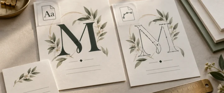
Editorial flat lay of two cream botanical stationery cards comparing a solid dark green letter M with an outlined M showing vector anchor points, surrounded by paper stacks, a brass ruler, binder clips, and greenery.

TLDR: Embed fonts in your print PDF by default. If the PDF reports the fonts as embedded or embedded subsets, displays correctly, and meets your printer’s requirements, there is usually no reason to outline everything. Convert text to outlines only when a printer specifically requests it, a font cannot be embedded, or a small amount of finalized display text needs to become independent of its font file. Always preserve an editable master before outlining.

The practical answer to embed fonts vs outline fonts is less dramatic than design forums sometimes make it sound. Both methods can prevent unwanted font substitution, but they do it differently. Embedding keeps text as text and packages permitted font data in the PDF. Outlining turns letters into vector shapes. For invitations, business cards, and stationery, embedding is normally the cleaner and more reversible workflow.

Font handling is also separate from the tactile decisions that make a card feel substantial. Outlining a script font will not make cardstock thicker, a matte surface smoother, or foil more reflective. It solves a file-dependency problem, not a paper or finishing problem.

Embedded fonts vs outlined fonts at a glance

Method What the PDF contains Main advantage Main drawback Best use
Embedded fonts Text plus permitted font data Preserves text behavior and avoids substitution when correctly embedded Embedding may be restricted by the font’s permissions The normal choice for verified print PDFs
Embedded subsets Text plus only the glyphs used in the document Can preserve appearance while including less font data Later editing may require characters that were not included Final PDFs that have already passed copy review
Outlined fonts Letters converted into vector paths Removes the output file’s dependency on the font Text is no longer normally editable as text A targeted fallback or printer-requested workflow

What embedding a font actually does

Font embedding places font information inside the PDF so another system does not have to find the same installed font. Adobe distinguishes full embedding from subset embedding. A full embedding includes the font, subject to its permissions, while a subset contains the glyphs used in the document. Correct embedding helps prevent font substitution when the file is opened or printed elsewhere. Adobe’s explanation of PDF font embedding and substitution provides the technical background.

Seeing “Embedded Subset” in a PDF font report is not automatically an error. It generally means the PDF contains the characters it needs rather than the complete font. For a finalized invitation containing only names, dates, and event details, that can be perfectly appropriate. The important questions are whether every font is accounted for, the PDF displays correctly, and the printer accepts the file.

Fonts can carry permissions that restrict embedding. A successful export therefore cannot be assumed for every typeface or every PDF workflow. If a font refuses to embed, check its license and export permissions rather than repeatedly changing random PDF settings and hoping the problem develops manners.

What happens when you outline text

Converting text to outlines changes each letter into one or more vector paths. The output no longer needs that font to draw those shapes, but the words also lose their normal text properties. Standard text editing, spell-checking, character substitution, and typographic controls are no longer available in the usual way.

That tradeoff matters on stationery because copy tends to change late. A ceremony time moves. A phone extension changes. Someone notices that “accommodations” has been misspelled in 36-point calligraphy. Editing outlined letters is closer to modifying a small illustration than correcting a sentence.

Adobe also notes that outlining removes font hinting and cautions that outlined type can appear less sharp at small sizes or low resolution. That does not mean outlined type always prints badly. It means outlining is not a universal quality upgrade, especially for tiny addresses, RSVP details, disclaimers, or compact business-card text. Review such type at actual size rather than judging it only at 800% zoom.

When converting text to outlines makes sense

Outlining is reasonable when there is a confirmed technical reason rather than a vague belief that printers prefer it. Common cases include:

  • Your printer explicitly requires outlined text for the selected workflow.
  • A licensed font will not embed, and the font’s terms permit the intended use and conversion.
  • The printer reports a missing-font problem after checking your submitted file.
  • A finalized logo, monogram, or short display treatment must remain visually fixed.
  • A specialty-production template specifically instructs you to supply certain lettering as vector artwork. Confirm the exact setup with the producer rather than applying that rule to the entire design.

Printer requirements differ. PrintRunner, for example, says that outlines are required in most cases when one of its jobs is held for missing fonts, although supplying a font file may sometimes be possible. It also warns that outlined text cannot later be typeset as ordinary text. That is a PrintRunner-specific workflow statement, not a rule for every commercial printer.

Why outlining every line is usually unnecessary

Blanket outlining creates extra risk without necessarily improving the printed object. It makes corrections slower, complicates accessibility and text extraction, and can make small type less forgiving. It may also leave a designer with only a flattened final file when the event date, employee title, or return address inevitably changes.

For a wedding invitation, outlining a custom monogram may be sensible if required; outlining the invitation, RSVP card, details card, and envelope copy before the wording is locked is not. Keep the suite editable through copy approval. The same principle applies to a business-card system: preserve editable names and contact details even if a fixed wordmark is supplied as vector artwork. See the guide to keeping a wedding invitation suite consistent or the business card layout and finish guide for the object-specific decisions surrounding those files.

How to check fonts in a print PDF

Do not rely only on the fact that the PDF opens on your own computer. Your computer may already have the fonts installed, which can conceal a missing-font problem. Use this pre-upload process instead:

  1. Save the editable source document under a clear master filename before changing any text.
  2. Export a new PDF using the printer’s current file specifications. Do not assume that one PDF preset suits every provider or specialty process.
  3. Open the exported PDF in a tool that can report document fonts. In many desktop Acrobat versions, the font list is available through the document properties, although menu labels can vary by version.
  4. Confirm that each expected typeface is identified as embedded or embedded subset. Investigate an unembedded font before upload.
  5. Inspect every page at normal viewing size and at high magnification. Look for substituted letters, missing glyphs, altered line breaks, shifted punctuation, broken ligatures, and unexpected boxes.
  6. Print a paper proof at 100% scale when practical. A desktop print is not a prediction of commercial color or paper feel, but it can expose type that is physically too small, cramped, or close to trim.
  7. If the printer provides a proof, compare it with the approved copy and your exported PDF. A proof is a checkpoint, not a ceremonial button labeled “yes.”

PrintRunner identifies PDF as its preferred file format and includes CMYK color, resolution, bleed, safe-area, and proofing guidance in its file-preparation instructions. Those requirements demonstrate why font status is only one part of preflight. Follow the current specifications of the printer actually producing the job.

A card and stationery proof needs more than a font check

Once the fonts are stable, inspect the details that will become physical. Small-format pieces are especially unforgiving because a tiny spacing or trim problem occupies a larger share of the design.

  • Copy: Verify names, dates, URLs, addresses, phone numbers, titles, and punctuation against the approved text.
  • Scripts and alternates: Check every capital, ligature, swash, numeral, and accented character. Decorative fonts can hide errors rather elegantly.
  • Actual-size readability: View or print the piece at 100% scale. Thin strokes and tiny reverse type deserve particular attention.
  • Bleed and trim: Extend background artwork according to the printer’s specifications and keep essential text inside its stated safe area.
  • Borders: Thin, close-fitting borders make small trim variation visually obvious. A wider margin or borderless design is often calmer.
  • Contrast: Make sure type remains distinguishable from photographs, patterns, and dark backgrounds.
  • Multiple pieces: Compare repeated names, colors, type sizes, and spacing across invitations, inserts, envelopes, thank-you cards, or employee card versions.

For invitation-specific checks, the wedding invitation printing checklist covers size, trim, paper, and finishing decisions that sit beyond font handling.

Paper and finish are a separate decision

Embedding and outlining determine how letterforms are represented in a file. They do not determine cardstock weight, stiffness, texture, coating, glare, writability, or the result of a specialty process. Those characteristics come from the selected stock, surface, print process, and finishing setup.

A textured stock, for example, can be a style choice with implications for very fine letterforms, while a glossy surface can change glare and perceived contrast. Those are production and design questions, not reasons to outline fonts. If the physical surface is still undecided, compare it separately using the guide to cardstock finishes. Confirm currently available stocks and finish-specific artwork requirements with the chosen printer before preparing final files.

A simple decision rule

  1. First, export a PDF with fonts embedded.
  2. Next, verify that every font is embedded or embedded as a subset and that all text displays correctly.
  3. If verification succeeds and the printer accepts embedded fonts, submit that PDF.
  4. If a font cannot be embedded, check its permissions and ask the printer which remedy it accepts.
  5. If outlines are required, duplicate the editable master, outline only the necessary final text, and export a separately named production PDF.
  6. Review the outlined production file at actual size and compare every word with the approved copy.

The final choice

For most invitations, cards, and stationery, choose an embedded-font PDF that has passed a proper font and visual check. Use outlines as a controlled fallback, not as a magic print-quality switch. Keep the source file editable, follow the selected printer’s current specifications, and inspect small type at the size people will actually hold in their hands. Then move on to the paper and finish—the decisions your fingers will notice.

References

  1. Font embedding and substitution in PDFs with Distiller | Adobe Acrobat
  2. Create outline text in Illustrator on the web (Beta) | Illustrator
  3. Convert text to outlines in InDesign | InDesign
  4. Frequently Ask Questions | PrintRunner
  5. File Preparation Guide – Format, Size, Bleed, etc. | PrintRunner